If you design for B2B companies, you already know the problem with finding the RIGHT inspiration. Dribbble and Behance are full of beautiful concepts, but most of them were made for portfolios, not for real campaigns. The ads and landing pages that actually run in front of professionals look very different from what you will find on those sites.
The LinkedIn Ad Library fixes this. It is a free, searchable database of every ad currently running on LinkedIn, and it gives you direct access to the creative that B2B companies are actually spending money on. You can see their layouts, typography choices, imagery, color palettes, CTAs, and copy, all organized by company or industry keyword. Moreover, you can also access the landing pages that these ads are directing to.
This guide is for designers who want to use the LinkedIn Ad Library for visual research and creative inspiration. We will walk through how to access it, how to search it effectively, how to break down what you find, and how to build a reference library that makes your B2B design work stronger over time.
Let's get into it.
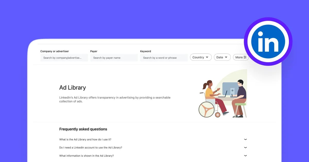
What is the LinkedIn Ad Library, and why should you care?
The LinkedIn Ad Library is a free, publicly available database where you can look up any ad that has run or is currently running on LinkedIn. Any company, any industry, any country. You do not need a LinkedIn account to use it, and there is no limit on how many searches you can do.
LinkedIn launched the library in 2023 after the EU's Digital Services Act (DSA) started requiring platforms to be more transparent about their advertising. Meta and TikTok had already released their own ad libraries, and LinkedIn followed suit.
But here's the thing: beyond the compliance angle, this tool is genuinely useful for design research. LinkedIn ads reach approximately 1.134 billion professionals every year, which is close to 14% of the global population. That is a massive library of real B2B creative that you can browse for free, any time you want.
For each ad, you can see:
- The full visual creative (images, videos, carousels)
- The headline and body copy
- The call-to-action type and button text
- Who created the ad and who paid for it
- For EU-targeted ads: estimated impression ranges and some targeting parameters
What the library does not give you is performance data. You will not see ad spend, click-through rates, conversion numbers, or any metrics that tell you whether an ad actually worked. So treat it as a visual research tool, not an analytics dashboard.
{{redirect}}
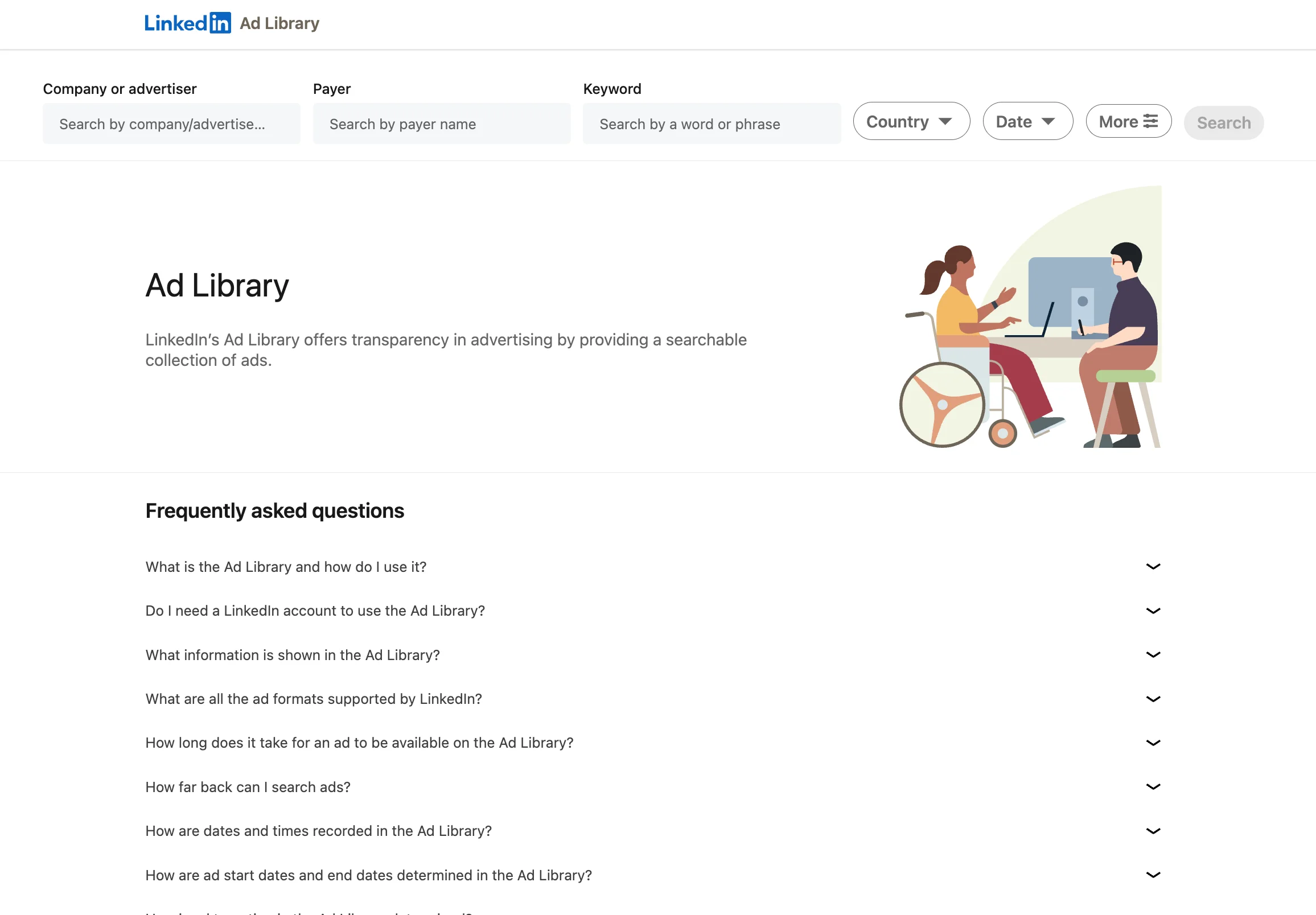
How to access LinkedIn Ad Library and start searching
There are two ways to access the library, and both take less than a minute.
The direct route:
- Go to linkedin.com/ad-library.
- You will see a search bar at the top.
- Type in either a company name or a keyword, and the results will load immediately.
- From there, you can use the dropdown menus to filter by country, date range, or media type.
- Click any ad to expand it and see the full creative, and click the CTA button to visit the landing page behind it.
The company page route:
- If you are already on a company's LinkedIn profile, look for the "Ads" tab.
- This shows you their active campaigns without needing to go to the library separately.
It is a quick shortcut when you are browsing a company's page and want to see what they are promoting.
For agencies or design teams doing research at scale, LinkedIn also offers an Ad Library API that lets you pull ad metadata programmatically. This is more relevant for automated monitoring than for day-to-day design inspiration, but it is worth knowing about if your team handles large competitor research projects.
Benefits of using the LinkedIn Ad Library for design inspiration
You see what real budgets pay for
Every ad in the library is live or was recently live, meaning a company made a deliberate decision to spend money on that specific creative. That is a different kind of validation than a concept that got likes on a portfolio site.
Repetition tells you what is working
When a company runs the same layout, format, or visual approach for weeks or months, they are continuing to invest because it is generating results. You cannot get that kind of signal from a static design gallery.
You can explore an entire industry's creative direction in minutes
Search a keyword like "CRM" or "cybersecurity" and you will see how dozens of brands in the same category handle their visual communication. This is the fastest way to understand the design language of a market you are less familiar with.
You get both halves of the experience
Every ad links to a landing page, and the relationship between the ad creative and the page it sends you to is where most of the important design decisions happen. The library lets you study that connection directly.
You can study high-performing formats before designing for them
Thought leader ads on LinkedIn average a 2.68% median CTR, which is over 6x higher than the 0.42% CTR of standard single image ads (as stated in ZenABM 2026 LinkedIn Ads Benchmarks, based on 161,256 ads across 211 companies). If you are designing for B2B clients, knowing what these formats look like before you start working is a real advantage.
Based on the top performing LinkedIn ad creatives, we created this LinkedIn ad template library. Feel free to check it and pick per your liking!
Limitations of the LinkedIn Ad Library
The LinkedIn Ad Library is a great starting point, but it has some clear gaps for design research. It only covers LinkedIn, so you are missing what companies run on Meta, Google, and other platforms entirely. There is no way to filter by ad quality or creative style, which means you will spend time scrolling through mediocre ads to find the good ones. The library does not show performance data, so you cannot tell which ads are actually working beyond the longevity signal. There is no way to save, tag, or organize ads within the library itself. And the ads are not available as editable files, so you are stuck taking screenshots instead of working from templates.
For casual browsing, these limitations are manageable. But if you are doing regular design research across multiple platforms, you will hit the ceiling fairly quickly.
How MagicLibrary helps you skip the research and get straight to the good ads
The LinkedIn Ad Library gives you everything. MagicLibrary gives you only the best.
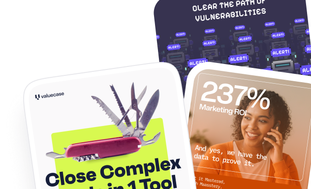
MagicLibrary is a curated ad library built specifically for designers and marketing professionals working in B2B. Instead of showing you every ad on one platform and letting you figure out which ones are worth studying, MagicLibrary does the curation for you. Every ad in the library has been selected for high visual quality and clear message delivery.
Here is why it is a strong next step if you have been using the LinkedIn Ad Library for research.
It covers multiple platforms in one place, for free
MagicLibrary includes ads from Facebook, Instagram, LinkedIn, and Google. You do not need to switch between LinkedIn's Ad Library, Meta's Ad Library, and Google's Transparency Center to get a full picture of how a company advertises. Everything is in one place.
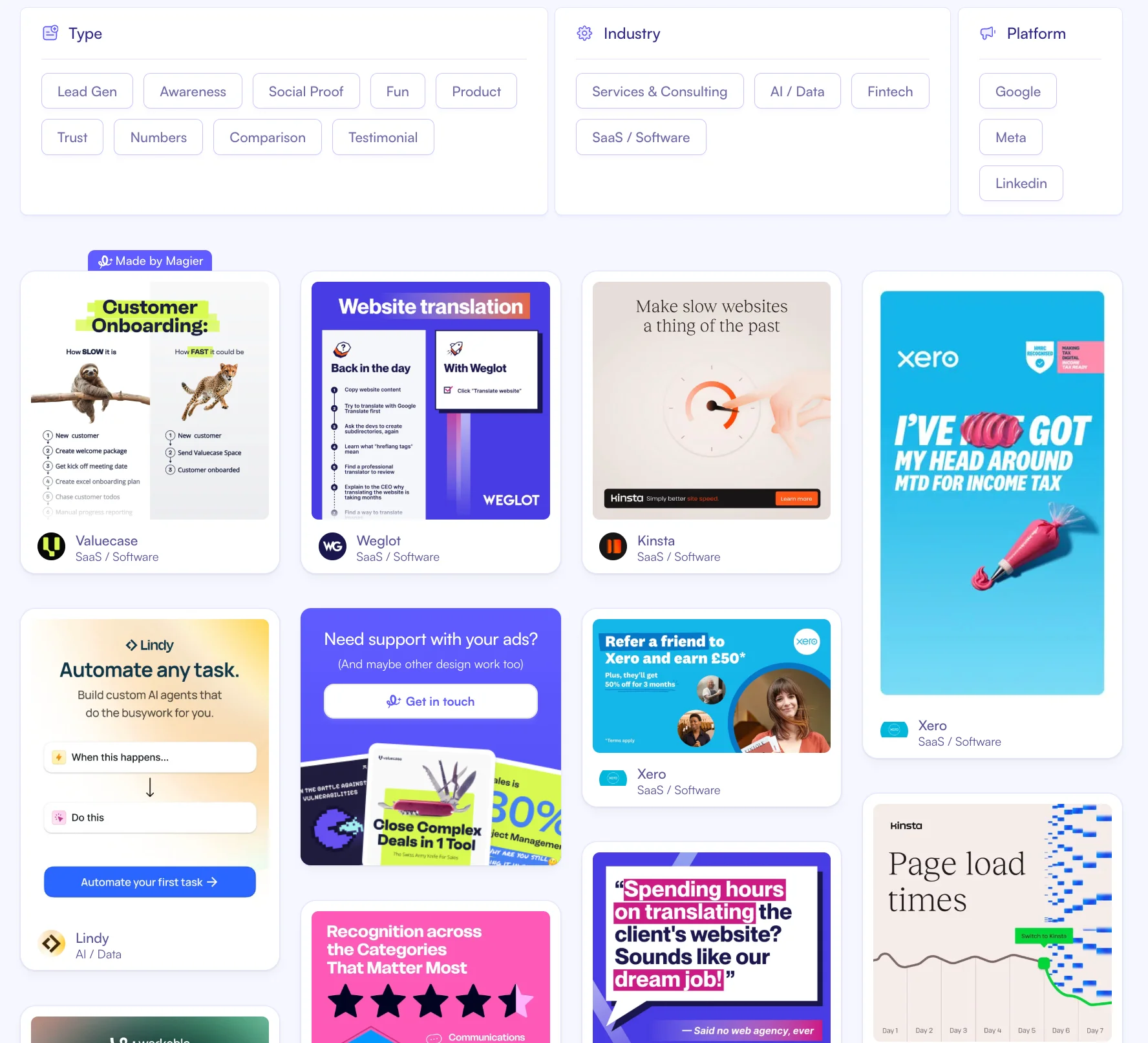
It is built for B2B, not everything under the sun
The library focuses on Ecommerce and SaaS companies, which means you are not wading through consumer, lifestyle, or local business ads to find B2B references. The ads featured are from companies like Webflow, Canva, Zapier, Xero, and other brands that invest seriously in their creative.
Every ad is categorized by type
Each ad is tagged by its creative approach: lead gen, awareness, social proof, fun, product, trust, numbers, comparison, or testimonial. If you need inspiration for a specific ad type, you can filter to exactly that category instead of scrolling through everything and hoping something relevant shows up.
Dedicated company pages let you see everything in one view
Each company in MagicLibrary has its own page where all of their ads are collected. If you want to study how Kinsta or Weglot approaches their ad creative across platforms, you can see their full portfolio in a single view rather than searching them separately on each platform's ad library.
The ads are available as editable Figma and Canva templates
This is where MagicLibrary goes beyond inspiration. Instead of screenshotting an ad and trying to recreate it from scratch, you can copy any ad directly into Figma or Canva with one click. All the formats are preserved, so you can start editing immediately with your own brand's text, images, colors, and logos.
It stays current with weekly updates and a newsletter
MagicLibrary adds 20+ new ads every week, so your references stay fresh. You can also sign up for the weekly newsletter to get new B2B ad inspiration and ad design breakdowns delivered to your inbox, which is a simple way to keep your eye trained without blocking time for research.
It has educational resources alongside the ads
Beyond the ad library itself, MagicLibrary publishes a blog and resources section with content on ad design strategy, creative trends, and practical design guidance. If you want to understand why certain ad formats work, not just see what they look like, these resources fill in the thinking behind the creative.
The LinkedIn Ad Library is free and worth using for broad competitive research. But if you want a curated, multi-platform, designer-first reference library that you can actually work from, MagicLibrary is built for exactly that.
{{ad-library}}
How to search the library for design inspiration
The library gives you a few different ways to search, and each one is useful for a different type of research.
Search by company name to study a specific brand's creative
This is the most direct approach. When you know a company with strong design work, type their name in and browse everything they are running. You will see their full portfolio of active ads in one place.
If you are looking for a starting point, companies like Webflow, Figma, HubSpot, Notion, Canva, and Salesforce are known for investing in their ad creative. But do not limit yourself to well-known brands. Search companies in your client's specific vertical too, including the smaller ones you have never heard of. Some of the most interesting B2B creative comes from companies that are not on anyone's radar yet.
When browsing a company's ads, pay attention to:
- The formats they use: single image, carousel, video, or promoted personal posts
- Their color approach: brand-consistent or deliberately high-contrast for feed visibility
- Typography decisions: large statement headlines vs. detailed body copy, and how font weight creates hierarchy
- Imagery choices: product UI, illustrations, photography, or abstract graphics
- How their visual language stays consistent (or shifts) across different campaigns
Search by keyword to see an industry's visual language
This is the underused approach, and it might be more useful for designers than searching by company name.
Type in a topic or industry term instead of a brand. Try "website redesign," "marketing automation," "enterprise software," "B2B SaaS," or "cloud security." The results will pull in ads from dozens of companies across that category, including many you would never have found on your own.
Why this matters: keyword search gives you a cross-section of how an entire market communicates visually. In five minutes, you can see whether a category tends toward product screenshots, illustration-heavy layouts, bold typographic treatments, or photography-led creative. That is a visual map no design gallery can give you.
Filter by country for localized research
If your client operates in a specific market, use the country filter. B2B ad creative varies across regions. What works in the US market may look noticeably different from what companies run in Germany or Australia.
This is becoming more relevant: LinkedIn's ad audience in Germany grew by 16.7% between 2024 and 2025 (source: Statista), so localized creative research is a real part of the B2B design process now.
Filter by date to see only current creative
Adjust the date range to the last 30 or 90 days if you want to focus on what is running right now. This keeps your references current and prevents you from pulling inspiration from outdated campaigns.
Need some hands-on assistance with your LinkedIn ads? Check out this list of the best LinkedIn ads agencies and find one per your needs.
How to break down an ad like a designer
Finding ads is quick. The real value is in how you dissect them. Here is a framework you can use every time you find something worth studying.
Start with visual hierarchy
Before you read any copy, look at the ad the way your eye naturally moves through it. What catches your attention first? Where does your eye go second? Is there a clear reading order, or is the layout trying to communicate too many things at once?
The strongest B2B ads almost always establish one dominant visual element, whether that is a headline, a product screenshot, or a person's face, and let everything else support it. Ads that give equal visual weight to five different elements usually feel cluttered. You will see plenty of both in the library, and the contrast is instructive.
Study typography and color choices
Look at how type is used. Is it a single bold statement in a large weight, or is it detailed copy in a smaller size? How does font weight contrast between the headline and the supporting text? Does the ad use the brand's standard typeface, or has it been adjusted for impact in the feed?
For color, notice whether the palette stays consistent with the brand or shifts toward high-contrast to grab attention. Some of the most effective B2B ads use one or two colors against a clean background. Others go bold with gradients or full-bleed photography. Track which approach shows up more often in your client's industry.
Identify the imagery approach
B2B ad imagery tends to fall into a few categories. Knowing which ones dominate a specific vertical tells you a lot about what that audience expects to see:
After reviewing 50 to 100 ads with this lens, you will start seeing which imagery categories dominate specific verticals. That knowledge is directly useful when you are making creative decisions for a client in that space.
Look at CTA design
The CTA is a small element, but it is worth your attention. Notice the button text (is it "Learn more," "Start free," "Download," or something more specific?), how prominent the button is relative to the rest of the creative, and where it sits in the layout. In carousel ads, notice whether the CTA appears on every slide or only the last one.
Click through to the landing page
This is the step most people skip, and it is where the best design research lives.
Click the CTA on any ad you find interesting. Then study the landing page it sends you to. Does the page's visual language match the ad? Is the hero section designed to continue the narrative from the ad, or does it feel disconnected? How is the form designed? Where are testimonials placed? What is the overall hierarchy from the top of the page to the bottom?
The ad is the first half. The landing page is where someone decides whether to take action. If you are designing both ads and pages for a client, understanding how the best B2B companies connect these two elements will make your work noticeably stronger.
Popular LinkedIn ad formats and what they look like
Spend a few sessions browsing and certain visual approaches will start repeating. Here is what is currently shaping B2B ad creative, and what each trend looks like as a design decision.
Product-led creative
A growing number of SaaS companies now lead with their actual product UI instead of stock photography or abstract visuals. These ads show dashboard screenshots, analytics views, workflow interfaces, or onboarding screens. The approach feels specific and credible because the viewer gets a real preview of the tool.
From a design perspective, these ads require careful attention to screenshot framing, background treatment, and how the UI is cropped to remain readable at feed size. Some brands use device mockups. Others float the interface on a gradient or solid background. The best ones simplify the screenshot just enough to be legible without losing the sense that this is a real product, not a concept.
Thought leader ads
Thought leader ads (TLAs) are one of the biggest format shifts on LinkedIn in recent years. A company takes a personal post from a founder, executive, or team member and promotes it as sponsored content. Visually, these do not look like traditional ads. They look like regular LinkedIn posts, which is a large part of why they perform so well.
The numbers back this up: TLAs average a 2.68% CTR compared to 0.42% for single image ads. For designers, the interesting question is how to work within a format that is deliberately minimal. The profile photo, the text formatting, the accompanying image or video, all of it needs to feel natural in the feed rather than designed. Study how brands choose which person to feature, what kind of visual accompanies the post, and how the text is structured for readability at different lengths.
Report and research-led creative
This is one of the most common lead generation formats on LinkedIn: a large report cover image, one bold statistic as the headline, and a download CTA. These ads promote whitepapers, benchmarks, or industry reports.
If you design lead magnet visuals or content marketing assets, study this category closely. The best report cover designs balance enough detail to feel substantial with enough simplicity to read clearly at a small size in the feed. Typography tends to be bold and minimal. Color palettes usually stay on-brand rather than matching the report topic.
Carousel and multi-frame storytelling
Carousel ads walk the viewer through a narrative across multiple slides, and they create a specific design challenge: keeping visual consistency across frames while making each individual slide compelling enough to keep the viewer swiping.
Pay attention to how the strongest carousels handle progression. Some use a consistent layout with changing content. Others build a visual story across frames, where each slide reveals something new. Notice how the first slide is designed differently from the rest, since it has to earn the swipe, and how the final slide anchors the CTA.
How to build a visual reference library from your research
Browsing the library is useful in the moment. But the compounding value comes from saving and organizing what you find. After a few weeks of this, you will have a reference library that reflects actual B2B creative, not award entries.
Organize your swipe file by visual approach
Save screenshots of ads that stand out, and sort them by how they look rather than what they promote. A folder structure that works well for designers:
- Product UI-led ads
- Typography-heavy and text-first ads
- Photography and people-led ads
- Illustration-led ads
- Carousel and multi-frame ads
- Report and lead magnet cover designs
- Thought leader ad formats
- Landing page screenshots (paired with the ad that links to them)
Figma, Milanote, and Notion all work well for this. Figma is especially useful if you want to annotate screenshots with notes about what you noticed.
Track broader trends in a spreadsheet
Alongside your visual swipe file, a simple spreadsheet helps you see broader patterns across industries. Here is a structure you can start with:
After a few weeks of logging, you will have a dataset that shows you which color approaches are common in specific verticals, which formats companies repeat, and how visual styles cluster by industry. That is research you can reference every time you start a new B2B project.
Make it a weekly habit
Set aside 15 to 20 minutes each week to browse new ads from companies in your client's space. This is not a huge commitment, but over a few months it builds a grounded understanding of what B2B creative actually looks like in the market.
You will start recognizing visual shifts before they become obvious trends. Your design recommendations will carry more weight because they are informed by what is actually running. And your swipe file will stay current instead of reflecting what was popular six months ago.
LinkedIn Ad Library vs. Meta Ad Library vs. TikTok Creative Center vs. X Ads Transparency: which one for B2B?
If your design work is primarily B2B, LinkedIn is the library to start with. If you work across both B2B and B2C, combining LinkedIn and Meta gives you the broadest reference.
Mistakes designers make when using the ad library
The library is easy to access. Using it well is a different thing. Here are the pitfalls we see most often.
Treating it like a template gallery
The purpose is not to find an ad and recreate it. It is to understand how an industry communicates visually and use that understanding to make your own creative decisions more informed. Copying a competitor's layout or color palette directly will produce work that blends in.
Equating visual polish with effectiveness
The most beautifully designed ad is not always the one that performs. In B2B, clear messaging and strong visual hierarchy often outperform highly polished, design-forward creative. Use the library to understand both what looks good and what companies keep running, because those two things are not always the same.
Only searching brands you already follow
If you only look at the companies you admire, you will stay inside a visual echo chamber. Use keyword search to explore beyond your usual references. Smaller companies and niche players in specific verticals often take more creative risks.
Visiting the library once and calling it done
A single session helps, but the real value comes from returning regularly. B2B creative trends shift, and your reference library should reflect what is current.
Skipping the landing page
The ad is only the first half of the visual experience. If you are not clicking through to study the page behind it, you are missing the design decisions that matter most for conversion.
Final thoughts
The LinkedIn Ad Library is one of the best free tools for understanding what B2B ads look like in the real market. Pair it with a curated resource like MagicLibrary and you will have more than enough inspiration to work from.
And if you ever need hands-on help with the actual design work, our expert designers at magier can take it from there. We have created thousands of ads for B2B companies and their marketing campaigns, so whether you need a single campaign or ongoing creative support, we are happy to help.
FAQ
What is the LinkedIn Ad Library?
The LinkedIn Ad Library is a free, publicly accessible database of every ad that has run on LinkedIn. LinkedIn launched it in 2023 to comply with the EU's Digital Services Act. It shows you the creative, copy, advertiser identity, and, for EU-targeted ads, impression ranges and targeting data. You can use it at linkedin.com/ad-library without logging in.
How do I search for competitor ads on LinkedIn?
Go to linkedin.com/ad-library and type a company name into the search bar. You will see every ad they are currently running. You can also search by keyword to see ads from all companies advertising around a specific topic, and filter by country or date range to narrow the results.
Can I use the LinkedIn Ad Library without an account?
Yes. The library is completely open. You do not need a LinkedIn account, a paid subscription, or any kind of login to search and browse ads.
What are thought leader ads on LinkedIn?
Thought leader ads are a format where a company promotes a personal post from a founder, executive, or team member as sponsored content. They look like organic LinkedIn posts rather than traditional ads. They average a 2.68% CTR, which is 6x higher than standard single image ads, making them one of the best-performing formats on the platform.
Does the LinkedIn Ad Library show ad spend?
Not for most ads. For ads targeted at EU audiences, the library provides estimated impression ranges, which can give you a rough sense of budget. But for the majority of ads, no spend, CTR, or conversion data is available. The library is a transparency and research tool, not a performance dashboard.
Is there a LinkedIn Ad Library API?
Yes. LinkedIn offers an API that lets developers pull ad metadata programmatically. This is useful for agencies or teams that want to automate competitor monitoring or integrate ad data into internal research dashboards.
.png)