.avif)
Most LinkedIn ads look the same.
A stock photo, a vague headline about "transforming your business," and a "Learn More" button nobody clicks. That’s the formula for every generic creative.
Good templates solve two things at once. They help you move faster because you're not starting from a blank canvas every time. And they give you a proven structure to work from, one that's already been tested across thousands of B2B campaigns.
This guide covers 15 LinkedIn ad templates for 2026, including the formats most B2B marketers are sleeping on right now. Thought Leader Ads, Lead Gen Form Ads, the carousel PDF method, and more. For each one, you'll get the layout, the copy specs, and real examples from brands doing it well to get started immediately.
Let's get into it.
Quick comparison: which template for which goal?
15 LinkedIn ad templates that can 10x your conversion
Template 1 - Platform & media social proof
Endorsements from third parties demonstrate how objective and persuasive your ads are. This template showcases your brand’s presence on well-known platforms or in trusted media outlets. It’s perfect for LinkedIn, where credibility and authority are essential for engagement and conversion.
Ad layout
A bold logo of the platform/media outlet at the top, followed by a concise description and a strong CTA button.
Ad elements
- Image: Logos of media outlets or platforms where your brand has been featured (e.g., "As seen on Forbes"). Add stars, ratings, and badges to make it visually persuasive.
- Header: “Trusted by [X] professionals and featured on [media/platform].”
- Text: “Learn why [numbers of companies] uses [product/service].”
- CTA: “Learn More”
Tips for this format
- Feature well-known platforms to maximize impact.
- Use clean, professional visuals for credibility.
- Keep text brief and to the point.
- Position your CTA prominently under the logos.
Social proof ad example

Template 2 - Client testimonial
Testimonials work wonders for establishing trust. A client testimonial ad on LinkedIn humanizes your brand and shows how it has positively impacted businesses or professionals.
Ad layout
Customer photo or logo on one side, testimonial text on the other, with a CTA at the bottom.
Ad elements
- Image: A professional headshot of the client or their company logo.
- Header: “See how [client name] transformed with [product/service].”
- Text: “With [product/service], we were able to [achieve result].”
- CTA: “Read Their Story”
Tips for this format
- Use testimonials that highlight measurable results or specific improvements.
- Include the client’s name, company, and title for added authenticity.
- Keep the layout clean and focused on the quote.
Client testimonial ad example

Template 3 - Before /after comparison
Visually demonstrate how your product or service solves a problem by comparing a “before” and “after” scenario. This format grabs attention and is perfect for industries like software, marketing, or productivity tools.
Ad layout
Side-by-side images or charts showing a stark difference, with captions and a CTA below.
Ad elements
- Image: Two visuals: one depicting the “problem” and another showcasing the solution.
- Header: “See the difference [product/service] can make.”
- Text: “Before: [problems]. After: [results].”
- CTA: “Start Now”
Tips for this format
- Use metrics or icons that highlight clear results.
- Use contrasting colors for the “before” and “after” sections.
- Add captions that make the transformation clear.
Before & after ad example

Template 4 - Resource / eBook sharing
Providing free resources like reports, guides, or eBooks is an excellent way to generate leads on LinkedIn. It’s a great strategy for content marketing and building trust in your brand. This template highlights the content’s value while encouraging users to download it.
Ad layout
The ad features the eBook/report cover on one side and a brief description with a CTA button on the other.
Ad elements
- Image: A 3D mockup of your eBook/report cover, styled professionally.
- Header: “Download our free [eBook/report] to [achieve benefit].”
- Text: “Inside, you’ll discover [key insight #1], [key insight #2], and more.”
- CTA: Get the Free Report”
Tips for this format
- Use a professional design for the report cover—it should look valuable.
- Make the CTA button stand out (e.g., bold colors).
- Mention that it’s free, if applicable.
Resource sharing ad example

Template 5 - Webinar promotion
Hosting webinars are a another way to showcase your company’s expertise online, and LinkedIn is the ideal platform to target a professional audience. This template highlights the event details and why users should attend.
Ad layout
Event date and title are front and center, followed by the benefits of attending and a CTA button.
Ad elements
- Image: A branded webinar banner featuring the speaker’s photo and the event title.
- Header: “Join us for [event name] on [date].”
- Text: “Learn [specific benefit] from [speaker/expert name].”
- CTA: “Reserve Your Spot”
Tips for this format
- Use professional headshots and branding for credibility.
- Emphasize the time and date to create urgency.
- Include a brief mention of the speaker’s credentials or expertise.
- Test variations of CTA text to see what drives registrations.
Webinar ad example

Template 6 - Data-driven visual
When you include numbers, your ads appear more credible to professionals. Sharing data and statistics is a powerful way to establish authority on LinkedIn. This template highlights key numbers that resonate with your audience, encouraging them to learn more.
Ad layout
A bold statistic at the top, followed by supporting text and a CTA. The design is clean and professional.
Ad elements
- Image: A chart, infographic, or statistic displayed in bold font over a branded background.
- Header: “Did you know [statistic]?”
- Text: “[Statistic] proves that [product/service] can help you achieve [benefit].”
- CTA: “Learn More”
Tips for this format
- Keep the statistic large and easy to read.
- Use high-contrast colors for better visibility.
- Focus on stats relevant to your audience’s challenges or goals.
- Provide context for the data in the accompanying text.
Data-driven ad example

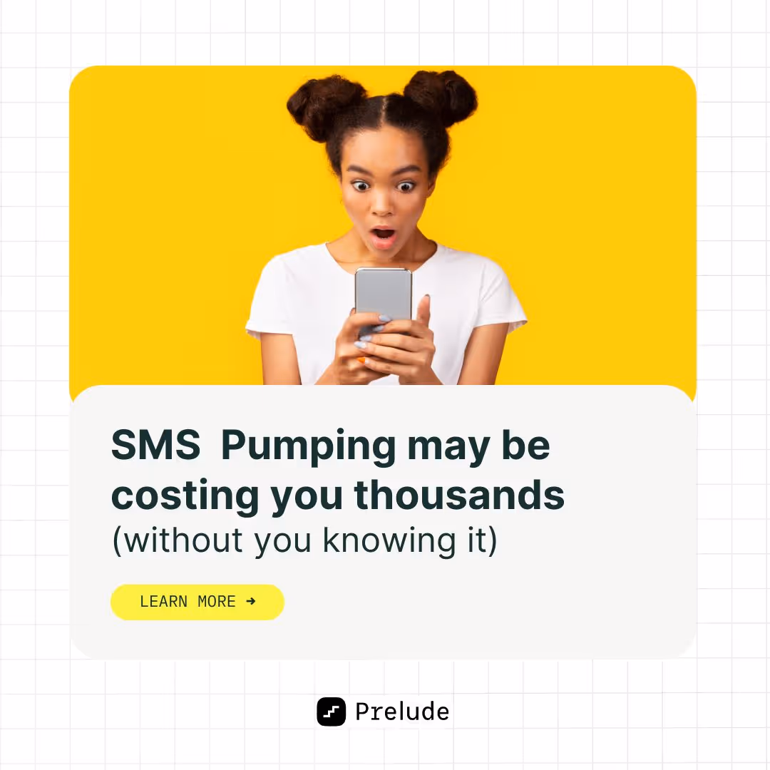
Template 7 - Problem-first hook
This appraoch grabs attention by addressing a common pain point first and then positioning your product as the solution. It’s effective for busy LinkedIn users who scroll quickly.
Ad layout
The problem is in bold text at the top, followed by an image illustrating the solution and a CTA below.
Ad elements
- Image: A relatable visual of someone experiencing the problem (e.g., frustration, inefficiency).
- Header: “Are you tired of [problem]?”
- Text: “[Product] helps you [solve problem] so you can [achieve benefit].”
- CTA: “Learn more”
Tips for this format
- Use empathetic language in the text.
- Ensure the solution image feels aspirational and achievable.
- Focus on one pain point at a time.
Problem-first ad example
Template 8 - Feature highlight
This template emphasizes one standout feature of your product or service. It’s ideal for LinkedIn’s professional audience, where highlighting key functionalities can drive action.
Ad layout
A close-up product image on one side and a feature description on the other.
Ad elements
- Image: A high-quality visual of your product, zoomed in on the feature.
- Header: “Discover [feature] with [product].”
- Text: “[Feature] allows you to [specific benefit]. Experience it today.”
- CTA: “See It in Action” or “Learn More.”
Tips for this format
- Highlight features that solve a pressing need or stand out from competitors.
- Use professional-quality visuals to showcase the feature.
- Keep the text concise and focused.
- Avoid cramming in too many features—one is enough.
Feature highlight ad example

Template 9: Thought leader ad
Thought Leader Ads let you promote a post from an individual employee's LinkedIn profile, whether that's a founder, CEO, or subject matter expert, rather than from your company page. The post appears as a sponsored version of something that already exists (or could exist) on that person's personal feed.
This matters because B2B buyers are increasingly skeptical of branded content. They scroll past company page posts. But they stop for a well-written take from a real person with a real perspective. Thought Leader Ads are how you turn that trust into paid reach.
Ad layout
A personal LinkedIn post with the photo of the individual at the top left, their name and title below, followed by the post copy. It looks native to the feed because it is. No heavy branded graphics needed.
Ad elements
- Profile: The real LinkedIn profile of a founder, executive, or expert at your company
- Hook (first line): This is everything. LinkedIn truncates after 2–3 lines, so your first sentence needs to earn the click to "see more." Use a bold claim, a surprising stat, or a direct challenge to conventional wisdom
- Body: First-person voice only. Share a specific experience, lesson, or data point. Write like you're talking to a peer, not presenting to a boardroom
- CTA (optional): A soft link at the end of the post, or a separate CTA button if running as a sponsored post ("Read the full breakdown," "Download the report")
- Character limit: 150 characters for intro text; post body can be longer but front-load the value
Tips for this format
- Use a real post that already performed organically. If it got engagement without spend, it'll do better with it
- First-person "I" voice consistently outperforms "we" in B2B LinkedIn content
- Avoid posts that feel like ads. The more it reads like a genuine personal take, the better it performs
- Founder or CEO content tends to get the highest engagement, but a credible subject matter expert works just as well
- Test 2–3 different hooks (first lines) to see which version stops the scroll
Thought leader ad example
.png)
Template 10: LinkedIn lead gen form ad
Lead Gen Form Ads are one of LinkedIn's most powerful native formats, and one of the most underused by B2B marketers who default to sending traffic to a landing page instead.
Here's the thing. Lead Gen Forms pre-fill with the user's LinkedIn profile data. Name, email, job title, company, and more. The user doesn't have to type anything. They just review the pre-filled info and hit submit. That's why they convert up to 5x better than landing pages for the same offer.
Ad layout
A standard single image or carousel ad on the outside, but clicking the CTA opens a native LinkedIn form with no redirect to an external website. The form displays your offer details, the pre-filled profile fields, and a submit button.
Ad elements
- Image: Clean, professional visual. Your report cover, event banner, or a simple benefit-focused graphic. 1200×628px or 1080×1080px
- Headline: Lead with the offer. "Download the 2026 B2B Design Benchmarks Report." 60 characters max
- Intro text: Reinforce the value. "Learn what 500+ marketing teams are spending on design and how to benchmark your own ops." 150 characters
- Form headline: "Get instant access" or "Reserve your spot." Keep it action-oriented
- Form fields: Only ask for what you actually need. Name + email is enough for most lead magnets. Adding company size or job title is fine for higher-value offers. More than 4–5 fields and drop-off increases
- Privacy policy link: Required by LinkedIn. Make sure yours is live
- CTA button: "Download," "Register," "Get the Report." Match it to the offer exactly
Tips for this format
- The offer has to be genuinely worth giving up an email for. A vague "request a demo" with no context won't convert. Pair it with a clear benefit statement
- Use qualification questions or hidden fields to segment leads by company size, role, or intent level. This saves your sales team a lot of time
- Connect your Lead Gen Form to your CRM (HubSpot, Salesforce, Zoho) via LinkedIn's native integrations or through Zapier/Make.com so leads flow in automatically
- Follow up within 24 hours. Leads from LinkedIn forms go cold fast
- Test your offer framing: "Free report" vs. "Instant access to X" vs. "Join 500+ teams who..." Small copy changes can move conversion rate significantly
Lead gen form ad example
.webp)
Template 11: Carousel ad (PDF method)
Carousel ads have been a LinkedIn staple for a while. But in 2026, the way savvy B2B marketers build them has changed.
Instead of using LinkedIn's native carousel upload (which strings together individual image cards), many are now uploading multi-page PDFs as Document Ads. The reason is simple. Document Ads display a page-flip animation in the feed that looks native and interactive. They get more dwell time, more organic reach, and because they feel more like content than an ad, more engagement.
The content structure is the same as a traditional carousel, but the format does more work for you.
Ad layout
A sequence of 4–10 slides, each designed as a standalone page in a PDF. Card 1 is the hook. It needs to stop the scroll and give a clear reason to swipe. Each subsequent card delivers one piece of value. The final card is your CTA.
Ad elements
- Card 1 (Hook): Bold headline, minimal design. "5 reasons your LinkedIn ads aren't converting." or "The B2B design mistakes we see every week." Make the benefit of swiping obvious
- Cards 2–N (Value): One idea per card. Use a mix of text, simple data visualizations, and short bullet points. Keep it scannable. Nobody reads a wall of text on a carousel card
- Final card (CTA): One clear next step. "Download the full guide," "Book a 20-min call," "Visit the link in bio." Include your logo and brand colors
- Headline (ad level): 45 characters per card. Use this space to tease what's on the next card
- Intro text: 150 characters. This appears above the carousel in the feed and is your first hook before anyone swipes
- File: Export as PDF, upload as a Document Ad in Campaign Manager
Tips for this format
- Design all cards at 1080×1080px (square). This looks best across both mobile and desktop feeds
- Keep each card to one idea. If you're writing more than 30 words per card, split it into two
- Use consistent branding across all cards. Same color palette, same font, same logo placement. The carousel should feel cohesive
- The hook card is everything. If card 1 doesn't earn the swipe, nobody sees the rest
- Use the carousel to deliver a mini-guide or framework, then gate the full version behind a Lead Gen Form. It's a natural content funnel
Carousel ad example
.webp)
Template 12: Competitor conquesting ad
Competitor conquesting is exactly what it sounds like. Targeting people who are actively searching for or engaging with your competitors, and showing them your ad instead.
On LinkedIn, this works by targeting by company (your competitor's company followers), by job title + industry (the persona most likely to be evaluating solutions in your space), or by using interest-based targeting around topics your competitors own. It's one of the highest-intent audiences you can reach. These people are already in buying mode.
Ad layout
Clean single image, typically with a direct comparison element or a bold differentiator claim front and center. No need to name the competitor directly (and usually better not to). Focus on what makes you the smarter choice.
Ad elements
- Image: Simple, high-contrast. A comparison table, a key differentiator stat, or a customer quote that addresses a known pain point of the competitor's product. 1200×628px or 1080×1080px
- Headline: Lead with your differentiator. "48-hour turnaround. No long-term contracts." or "Everything [Competitor] does, without the agency fees." 70 characters
- Intro text: Acknowledge the evaluation without calling anyone out. "If you're comparing design services right now, here's what most agencies won't tell you upfront." 150 characters
- CTA: "See How We Compare," "Start Free," "Book a Demo." Something with low friction that matches where they are in the funnel
- Social proof element: A Trustpilot rating, a G2 badge, or a short client quote works well here. It lowers the perceived risk of switching
Tips for this format
- Don't name competitors directly in the ad copy. It can come across as defensive and LinkedIn may flag it. Let the targeting do the work; let the creative focus on your strengths
- Use a comparison table visual if your product has a clear feature or pricing advantage. Make the decision easy
- Pair this with a retargeting campaign for people who visited your pricing page. They're the warmest leads of all
- Test "alternative to [category]" framing vs. direct differentiator claims. Both work, but for different audiences
- Connect this campaign to an ABM sequence. When a specific company engages with this ad, trigger a personalized outbound follow-up
Competitor conquesting ad example
.webp)
Template 13: Myth vs. reality ad
The Myth vs. Reality format is a pattern interrupt. It works by leading with a common belief your audience holds, something they've accepted as true, and then flipping it. That tension creates curiosity, and curiosity gets clicks.
It's particularly effective for B2B SaaS and service brands whose value proposition challenges the status quo. "You don't need to hire a full-time designer." "Your agency doesn't need a 3-month runway to get started."
Ad layout
A split visual. "Myth" on one side (often with a red X or struck-through text), "Reality" on the other (with a green checkmark or bold positive statement). Clean, high-contrast design. The visual does the storytelling, and the copy reinforces it.
Ad elements
- Image: Two-column layout or stacked cards. Left/top: the myth (what people incorrectly believe). Right/bottom: the reality (what's actually true, ideally with a data point or specific claim). 1200×628px landscape or 1080×1080px square
- Headline: Echo the reframe. "Design doesn't have to slow your campaigns down." or "You don't need a full-time designer to ship great creative." 70 characters
- Intro text: Set up the myth directly. "Most marketing teams assume getting quality design means weeks of back-and-forth. Here's what we see instead." 150 characters
- CTA: "See How It Works," "Learn More," "Get Started." Keep it low pressure. This is an awareness/consideration format
- Optional: A short customer quote or stat on the "Reality" side adds credibility to the reframe
Tips for this format
- The myth has to be something your audience genuinely believes, not a strawman. Do the research. Check forums, customer interviews, sales call recordings for the real objections
- Keep the "Reality" side specific. "It's actually easy" is weak. "Our clients get first drafts within 48 hours" is strong
- This format works well at the top of the funnel for cold audiences who don't know your brand yet
- Test different myths. You may find one resonates significantly more than others with your specific audience
- Follow up with a retargeting ad that goes deeper on the "Reality" claim with a case study or data
Myth vs. reality ad example
.webp)
Template 14: ROI / calculator visual ad
For B2B buyers, the final barrier to conversion is almost always the same. "How do I justify this cost internally?" The ROI visual ad addresses that question head-on, before they even have to ask it.
Instead of selling the product, you're selling the outcome. And you're making it concrete. A specific number, a percentage improvement, a dollar figure. Something a decision-maker can take into a budget conversation.
Ad layout
Bold, large-format number or percentage front and center. It takes up most of the visual real estate. Supporting context below in smaller text. Clean background, minimal clutter. Think Stripe's "10.5% revenue growth" ad. The number is the hero.
Ad elements
- Image: One dominant stat in large, bold typography. Supporting context in 1–2 lines below. Brand logo in the corner. 1200×628px or 1080×1080px. Use high-contrast colors. The number needs to be readable at a glance
- Headline: Restate the outcome in plain language. "Cut design turnaround time by 60%." or "150+ brands. 4.8/5 average rating." 70 characters
- Intro text: Give the stat context and connect it to the reader's situation. "Marketing teams working with magier ship design-heavy campaigns faster, without adding headcount." 150 characters
- CTA: "See the Results," "Read the Case Study," "Book a Demo." Match to the next logical step after seeing a compelling number
- Optional: Add a secondary stat or a short client attribution ("Head of Marketing, Series B SaaS") to add credibility to the primary number
Tips for this format
- The stat has to be real and specific. Vague claims like "improve your ROI" convert poorly. "Teams save an average of 12 hours per week on design requests" converts well
- If you don't have a client-facing stat yet, use your own operational proof. Turnaround times, number of brands served, Trustpilot rating, tasks completed
- Use high-contrast colors for the number. It should be readable as a thumbnail before anyone clicks
- This format pairs well with a Lead Gen Form (the stat earns the click, the form captures the lead) or a case study landing page
- Test different stats. Sometimes, a time-saving metric outperforms a cost-saving one, depending on your audience's primary pain point
ROI / calculator visual ad example
.webp)
Template 15: Dashboard preview / product screenshot ad
For SaaS and design service brands, one of the most effective things you can do in an ad is simply show the product. Not describe it, not claim it's great. Show it. A clean dashboard screenshot or a before/after design preview does more to build understanding and desire than almost any copy-heavy format.
This template is particularly effective for mid-funnel audiences who already know they have a problem and are evaluating solutions. Seeing the interface or the output removes uncertainty and builds confidence.
Ad layout
The product or output takes up most of the visual. A short headline overlaid or positioned below contextualizes what they're looking at. The ad feels more like a product demo than a promotional creative.
Ad elements
- Image: A clean, high-resolution screenshot of your dashboard, product interface, or (for design services) a before/after of a real client output. No cluttered UI, no tiny text. Crop to show the most impressive or immediately understandable part. 1200×628px or 1080×1080px
- Headline: Name what they're looking at and why it matters. "All your design requests. One place." or "From brief to delivered, in 48 hours." 70 characters
- Intro text: Set context before they see the image. "This is what managing your design ops looks like with magier. No back-and-forth, no delays, no surprises." 150 characters
- CTA: "See It in Action," "Book a Demo," "Get Started." This format works best with a low-friction next step
- Optional: Add a small client logo or Trustpilot rating in the corner to add social proof without cluttering the main visual
Tips for this format
- Quality of the screenshot matters enormously. A pixelated or cluttered UI screenshot will hurt more than it helps. If your interface isn't visually clean, use a designed mockup or show the output (the finished design) instead
- For design services, a side-by-side before/after of client work often outperforms a plain screenshot. It makes the transformation tangible
- This format works best for retargeting (people who've visited your website but haven't converted) because it reinforces what they already know and removes the last objection
- Test showing different parts of the product. Sometimes, a specific feature view converts better than the full dashboard
- Keep the surrounding copy minimal. The visual is the hero here. Don't compete with it
Dashboard preview ad example
.webp)
{{ad-library}}
Why LinkedIn ads are different from other social ads
Before you copy a template that worked on Instagram and paste it into LinkedIn Campaign Manager, it's worth understanding why that usually doesn't work.
LinkedIn is a professional network. The people scrolling through their feed are doing so between meetings, during a commute, or while reviewing their inbox. They're not in entertainment mode. They're in work mode. That changes everything about how you need to show up.
A few things that are true on LinkedIn that aren't true elsewhere:
Credibility is everything
Your audience is made up of decision-makers. Founders, CMOs, heads of marketing, directors. They have high BS detectors and limited patience for vague claims. Every ad needs to earn its place in their feeds by offering something genuinely useful or credible.
Value-first beats hype every time
On Instagram, a flashy visual can do a lot of heavy lifting. On LinkedIn, the copy matters just as much as the creative. Sometimes more. Ads that lead with a specific insight, a data point, or a concrete outcome consistently outperform ads that lead with brand awareness.
People trust people more than logos
This is why Thought Leader Ads, which promote content from a real person's profile rather than a company page, are one of the highest-performing formats in 2026. B2B buyers are more likely to engage with a post from a founder or expert than from a brand account.
The formats are different
LinkedIn has ad types you won't find anywhere else. Lead Gen Forms that pre-fill with profile data. Conversation Ads that work like a branching dialogue tree. Dynamic Ads that personalize automatically using the viewer's own LinkedIn photo or name. These aren't just LinkedIn versions of Facebook formats. They're built specifically for professional context and B2B buying behavior.
Keep all of this in mind as you work through the templates below.
LinkedIn ad specs: quick reference (2026)
Before building anything, you need to get the specs right. Nothing wastes more time than designing an ad and then realizing the dimensions are wrong or your headline is 20 characters too long. Here’s a quick reference chart per LinkedIn's official guidelines:
A note on mobile vs. desktop sizing: The 1:1 square format (1080×1080px) takes up significantly more real estate on mobile feeds than the standard 16:9 landscape format. If most of your audience is on mobile, which is increasingly the case, design for 1:1 first.
A note on the carousel PDF method: In 2026, many B2B marketers have moved away from native LinkedIn carousel uploads and toward uploading multi-page PDFs as Document Ads instead. The reason is that Document Ads show a page-flip preview in the feed, which increases dwell time and organic reach before you even put spend behind it. More on this in the carousel template below.
How to customize these templates for your brand
Having a template is one thing. Getting it to actually work for your specific brand, audience, and goal is another. Here's how to go from template to ready-to-launch in the least amount of steps.
Step 1: Match the template to your goal
Don't pick a template because it looks good. Pick it because it's the right format for where your audience is in the funnel. Cold audiences need hooks and education (Myth vs. Reality, Thought Leader, Data-Driven Visual). Warm audiences need proof and reduced friction (Testimonial, ROI Visual, Lead Gen Form). Retargeting audiences need a reason to act now (Competitor Conquesting, Dashboard Preview, Before/After).
Step 2: Swap in your brand identity
Colors, fonts, and logo placement are the key to building your brand authority. These should be consistent across every ad you run. LinkedIn users see your ads multiple times before they convert. Brand consistency is what makes that repetition build trust instead of just being noise.
Step 3: Write your headline first
You have 70 characters. Lead with the clearest, most specific benefit or claim you can make. "Expert designers, 48-hour turnaround" beats "Transform your design workflow" every time. If your headline could apply to any company in your space, rewrite it.
Step 4: Choose one CTA and commit
Every template has one job. Don't give the reader two options. Pick the one next step that makes the most sense for the format and the funnel stage, and make it specific. "Get the Report" converts better than "Learn More." "Book a 20-Minute Call" converts better than "Contact Us."
Step 5: Run at least 3 variations
No template is perfect out of the box. Change one variable at a time (the hook, the visual, the CTA) and let the data tell you what works. The best B2B advertisers on LinkedIn are running 5–10+ active creatives at any given time, testing their way to high performers.
Step 6: Brief your designer clearly
If you're not designing these yourself, a clear brief saves everyone time. Specify the format, dimensions, the headline copy, the key visual, and any brand guidelines. If you're producing a lot of ad creative regularly and the back-and-forth is slowing you down, a subscription design service like magier gives you a dedicated team with 48-hour turnaround. No briefing a new freelancer every time.
Wrapping up
A good LinkedIn ad template doesn't do the thinking for you. It gives you a proven structure so you can focus on the part that actually matters: the message, the offer, and who you're talking to.
The 15 formats in this guide cover the full spectrum of what works in B2B LinkedIn advertising in 2026. From the high-trust Thought Leader format to the high-conversion Lead Gen Form, from the pattern-interrupting Myth vs. Reality to the proof-heavy ROI Visual. Pick the format that fits your goal, customize it for your brand, and test more than you think you need to.
One thing that trips up most B2B teams, though, is the creative itself. Having the right template structure is step one, but the design still needs to be on-brand, polished, and built to spec. If that's the bottleneck for your team, magier's design subscription gives you access to expert designers with 48-hour turnaround and no long-term commitments. Brief once, get it done fast, move on to the next test.
Time to make some ads that are worth clicking!
{{redirect}}
FAQ
What is a LinkedIn ad template?
A LinkedIn ad template is a pre-built design framework for a specific ad format. It includes the layout, visual structure, copy placeholders, and design elements you need to create a professional LinkedIn ad without starting from scratch. Templates are typically available in Canva, Figma, or as PDF downloads, and are structured around proven formats like social proof, testimonials, carousels, and Lead Gen Forms.
What size should a LinkedIn ad image be?
The two most common sizes are 1200×628px (16:9 landscape, best for desktop) and 1080×1080px (1:1 square, best for mobile). For vertical video ads, use 9:16 (1080×1920px). When in doubt, design in 1:1. It performs consistently across both mobile and desktop feeds.
How long can LinkedIn ad copy be?
Headline copy: 70 characters max. Intro text (the copy above the ad): 150 characters before LinkedIn truncates with a "see more" link. For Conversation Ads, CTA buttons are limited to 60 characters. For Lead Gen Forms, the form headline is 60 characters. Keep your most important message within these limits. Don't rely on people clicking "see more."
What are Thought Leader Ads on LinkedIn?
Thought Leader Ads are a LinkedIn ad format that lets companies sponsor posts from individual employees' personal profiles rather than from the company page. They look like organic personal posts in the feed, which is why they tend to get higher engagement. They're particularly effective for founders, executives, and subject matter experts whose personal content already performs well organically.
What is the LinkedIn carousel PDF method?
Instead of using LinkedIn's native carousel format (which uploads individual image cards), the PDF method involves designing your carousel as a multi-page PDF and uploading it as a Document Ad. The result is a page-flip animation in the feed that increases dwell time and often gets more organic reach than a standard carousel. Many B2B marketers in 2026 are switching to this method for content-heavy carousel campaigns.
How do LinkedIn Lead Gen Forms work?
Lead Gen Forms are native LinkedIn forms that open when someone clicks your ad's CTA. No redirect to an external landing page. The form automatically pre-fills with the user's LinkedIn profile data (name, email, job title, company, etc.), which dramatically reduces friction. They convert up to 5x better than landing pages for the same offer. Once submitted, leads can sync directly to your CRM via LinkedIn's native integrations or through tools like Zapier or Make.com.
Where can I get free LinkedIn ad templates?
Figma and Canva both have free LinkedIn ad template libraries. Search "LinkedIn ad templates" within either platform. Each template in this article also includes a free Canva/Figma link you can copy and edit directly. For more polished, brand-specific templates, tools like BannerBoo and Adobe Express also offer LinkedIn-specific formats.
What is the best LinkedIn ad format for B2B?
It depends on your goal. For lead generation, Lead Gen Form Ads consistently outperform other formats. For brand awareness and trust-building, Thought Leader Ads are increasingly effective. For mid-funnel nurturing, carousels and data-driven single image ads work well. The honest answer is that the best format is the one you test most consistently. No single format wins every time across every audience.
How do I create a LinkedIn ad mockup?
Tools like Mediamodifier and LinkedIn's own Campaign Manager preview function let you see how your ad will look in the feed before it goes live. Figma also has free LinkedIn ad mockup templates that show the ad in context. Always preview before launching. What looks good in isolation can look very different in an actual LinkedIn feed.
What is the difference between LinkedIn Sponsored Content and Dynamic Ads?
Sponsored Content (which includes single image, carousel, and video ads) appears directly in the LinkedIn feed and is the most common format. Dynamic Ads appear in the right column on desktop and personalize automatically using the viewer's own LinkedIn data (their photo, name, or company) to increase relevance. Dynamic Ads are best for follower campaigns, job ads, and content downloads where personalization adds value.