Instagram is all about visual storytelling and lifestyle integration, especially the immersive full-screen formats like Stories and Reels, as well as its ads.
Unlike Facebook's text-heavy approach or LinkedIn's professional tone, Instagram demands high aesthetic quality and native-feeling content. Because the platform combines entertainment with shopping functions seamlessly, it's a great platform for e-commerce and direct-to-consumer (DTC) businesses to reach wider audiences and drive conversions.
Whether you're a DTC brand, SaaS company, or local business, the best Instagram ad examples share common traits: scroll-stopping visuals, native-feeling content, and creative that doesn't feel like advertising.
In this guide, we'll break down real Instagram ad examples across industries — including e-commerce, fintech, beauty, and B2B — and show you what makes each one convert. We'll also cover key metrics like ROAS and CTR, UGC strategies, and AI tools transforming Instagram advertising in 2026.
Best Instagram ad examples by format and strategy
1. Linktree
Format: Feed ad
Objective: Conversion
Strategy: Problem-solution

- Ad Type: Problem-Solution Ad
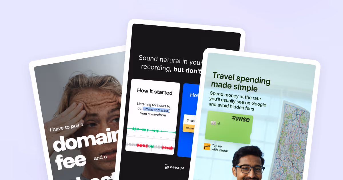
- Visual: The ad shows a close-up image of a concerned person with a strong expression of frustration. The text emphasizes the costs of running a website, specifically “domain fee” and “hosting fee,” with bold, large typography to capture attention.
- CTA: “Ditch your website. Get a Linktree.”
- What’s good about this ad: The ad identifies a common pain point for individuals or businesses, specifying the cost of domain and hosting fees for websites. By presenting Linktree as a better alternative, it positions the service as a practical solution for users. The bold typography and the eye-catching background emphasize the problem, while a conversational CTA provides a clear resolution. The human face with emotion is a proven scroll-stopper—faces with expressions outperform faceless product shots.
2. Descript
Format: Feed ad
Objective: Conversion
Strategy: Before/after comparison
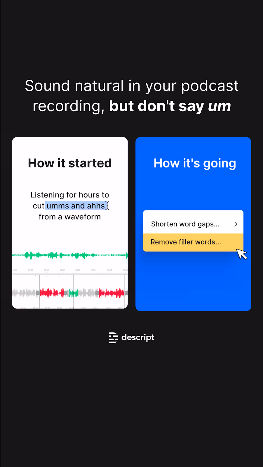
- Ad Type: Before/After Ad
- Visual: The split-screen layout indicates two different user experiences—before and after using the product. The "How it started" side is visually more complicated, resonating with the tedious podcast editing process. The "How it's going" side displays a simplified interface with a “Remove filler words” option, suggesting ease and efficiency. The bold text in the header (“but don’t say um”) emphasizes the core value proposition.
- What’s good about this ad: This ad uses meme language (“How it started” and “How it’s going”)to express the "before and after" format, offering a fresh take. The ad’s clean, straightforward design and use of familiar language ("umms and ahhs") make it relatable. By contrasting the labor-intensive manual process with Descript’s automated solution, it cleverly delivers the software’s time-saving benefit. The meme format is instantly recognizable to Instagram users, making this feel native rather than like an ad.
3. SurveyMonkey
Format: Feed ad
Objective: Lead generation
Strategy: Visual metaphor
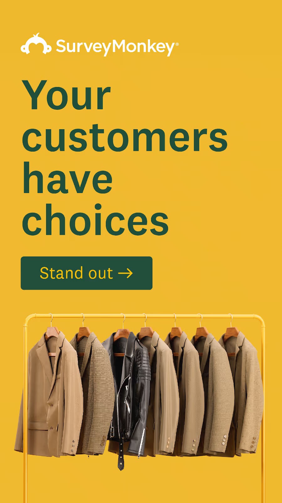
- Ad Type: Problem-Solution Ad
- Visual: The ad uses a visual metaphor to represent the idea of standing out among similar options. The bold yellow background and dark green text create a contrasting, attention-grabbing color scheme. The SurveyMonkey logo is displayed at the top, and the “Stand out” button is big and clear.
- CTA: "Stand Out"
- What’s good about this ad: This ad uses visual storytelling to remind the target audience, namely business owners, of the challenge they are facing: the market is competitive. The call to stand out creates a sense of urgency and strong motivation for the audience to take immediate action. It subtly suggests that SurveyMonkey can help brands differentiate themselves by appealing to customers. The clean design and metaphor make the message clear and memorable. The clothing rack metaphor (standing out among identical items) is immediately understood; visual metaphors communicate faster than text.
🙋🏻♀️ Want to have stunning visuals like these for your ad campaigns but don’t have enough team support? magier can be your perfect design partner! Book a free consultation with us to explore your options.
4. Wise
Format: Feed ad
Objective: Conversion
Strategy: Lifestyle + feature callout

- Ad Type: Feature Callout Ad
- Visual: The ad features a cheerful person holding a large map, creating an emotional connection with frequent travelers. The catchphrase "Travel spending made simple" is clear. The bright green Wise card is prominently displayed alongside the Interac logo, making the integrated feature easy to understand.
- What’s good about this ad: What’s good about this ad: This ad focuses on Wise’s value proposition for international travelers. The image makes the ad relatable and emotionally engages the target audience. While the benefit-oriented header catches attention, the subheader provides a further explanation, offering transparency and building trust. By mentioning the Google exchange rate, the ad also addresses common pain points. Real people in aspirational situations (traveling with a map) create emotional connection and help users visualize themselves using the product.
5. ahead
Format: Feed ad
Objective: App install
Strategy: Humor + social proof
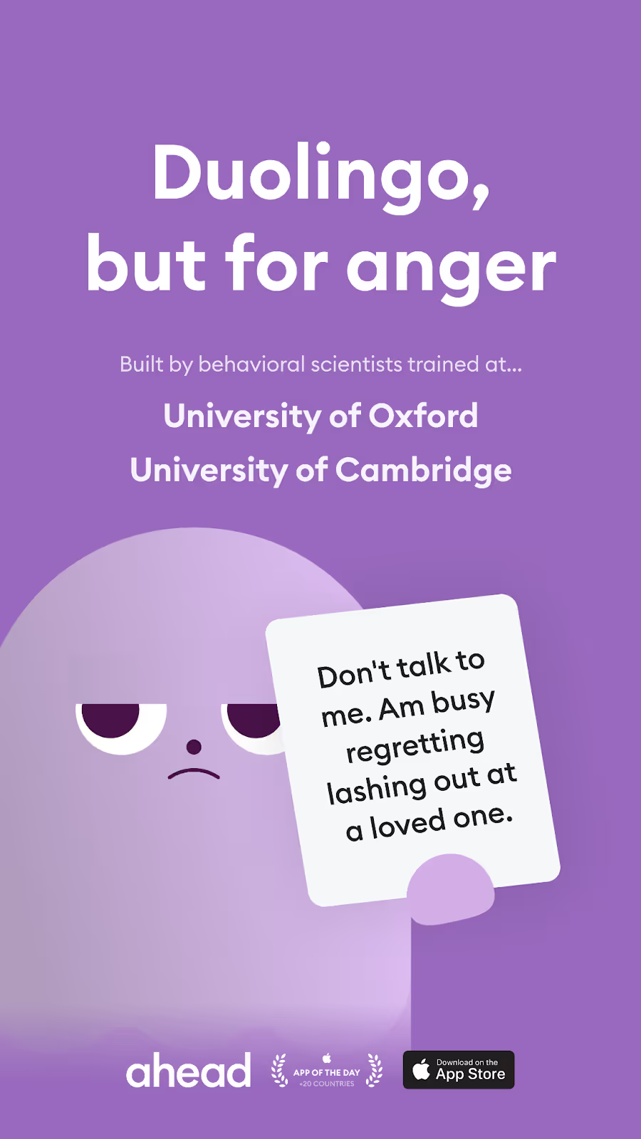
- Ad Type: Explainer + Social Proof Ad
- Visual: The ad uses a playful, purple background with a minimalist cartoon character showing a humorous yet relatable emotion—regret. The catchphrase, "Duolingo, but for anger," is bold and instantly clarifies the app's purpose with a familiar reference. The app’s logo and Apple Store badges showcase credibility visually.
- What’s good about this ad: This ad combines humor with relatable scenarios to attract attention and resonate with the target audience. By likening itself to Duolingo, it conveys that the app has both educational and gamified features. The mention of prestigious universities strengthens the app's credibility. The design and copy communicate a lighthearted approach to a serious topic, aligning with the value and branding position of the product. The "X, but for Y" format is instantly understandable and borrows credibility from the reference brand (Duolingo).
6. Eva Home
Format: Feed ad
Objective: Conversion
Strategy: Price comparison
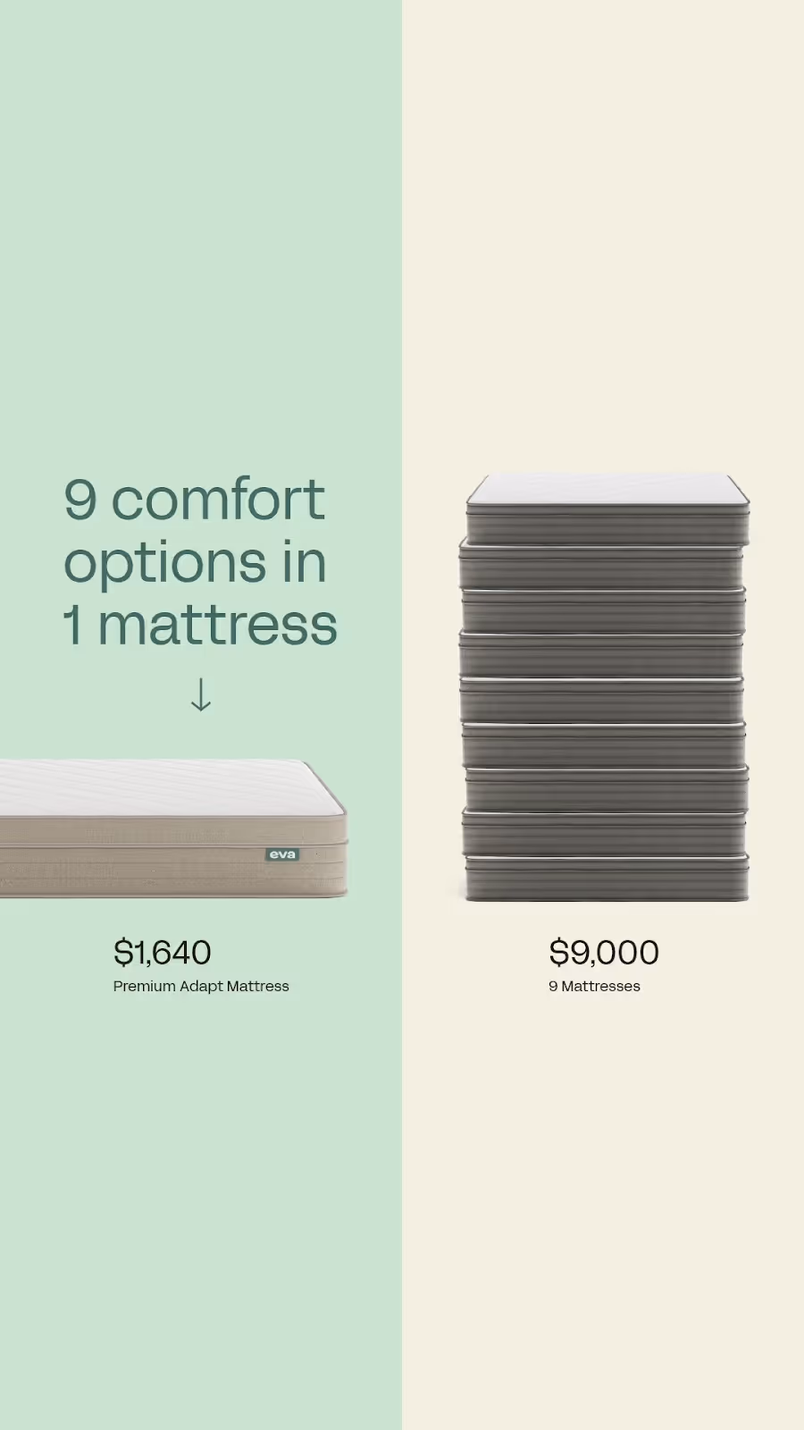
- Ad Type: Comparison Ad
- Visual: A single Eva Mattress versus a stack of nine standard mattresses—the comparison is very clear. The catchphrase and price difference further explain the benefit of the product This clear, minimal design emphasizes Eva’s value and versatility
- What’s good about this ad: This ad highlights the product’s convenience and cost savings with visuals, one simple header, and numbers (prices). The visual contrast quickly conveys the concept. The ad’s clean, organized layout and gentle color scheme enhance readability and resonate with the comforting value the product stands for. Price comparisons with specific numbers ($1,640 vs $9,000) are highly effective for considered purchases.
7. Jones Road Beauty
Format: Feed ad
Objective: Conversion
Strategy: Social proof + seasonal offer
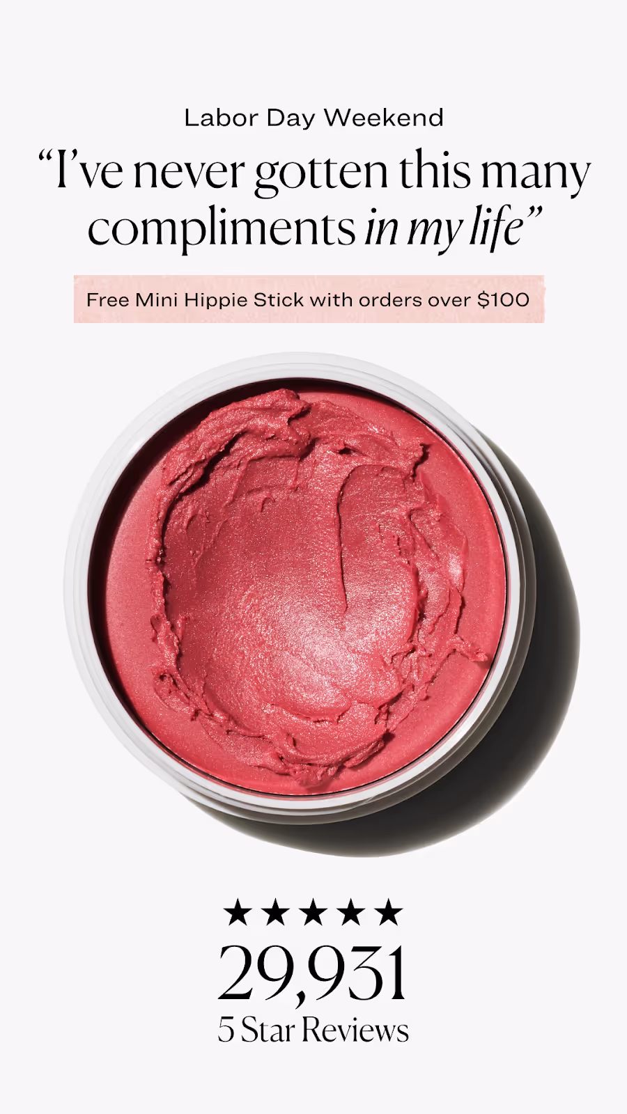
- Ad Type: Social Proof Ad
- Visual: A close-up of a vibrant pink product definitely draws attention to its color and texture. The quote “I’ve never gotten this many compliments in my life” indicates a strong, positive, emotional evaluation by the user. At the bottom, a five-star rating and “29,931 5 Star Reviews” emphasize customer satisfaction and trust.
- What’s good about this ad: This ad stacks multiple conversion triggers: social proof (29,931 reviews), urgency (holiday weekend), and added value (free gift with purchase). The testimonial "I've never gotten this many compliments in my life" is specific and emotional — far more compelling than generic praise. The specific review count builds immediate trust.
8. Joy Milk Tea
Format: Feed ad
Objective: Drive conversions
Strategy: Product comparison + discount offer

- Ad Type: Comparison Ad
- Visual: The ad uses visual elements to contrast their product with their competitor’s. On the left, an image of typical milk tea is shown with a blended background and standard font. On the right, JOY Milk Tea is highlighted with a vivid imagery background, bolder font, and text with icons. The slogan and the five-star rating provide additional visual support.
- CTA: "Get 15% Off Today"
- What’s good about this ad: It addresses common complaints about milk tea and positions JOY as the healthier, more natural option, appealing to health-conscious consumers. The clean, divided layout quickly communicates benefits, while the discount offer encourages immediate action.
9. Buffy
Format: Feed ad
Objective: Drive conversions
Strategy: Question hook + benefit checklist
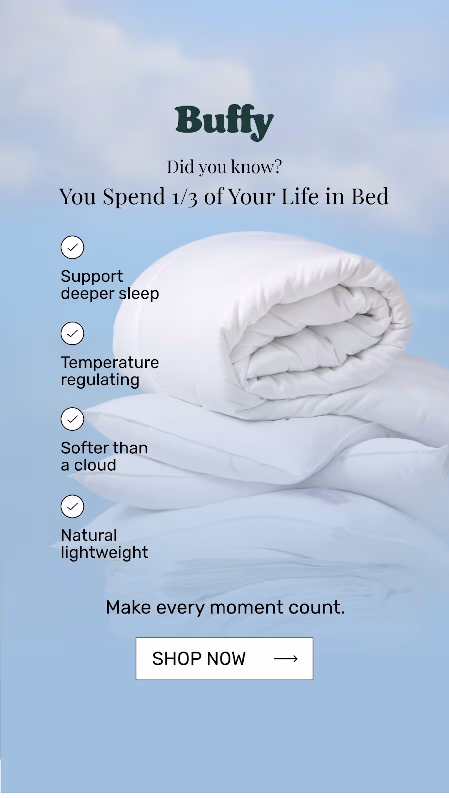
- Ad Type: Question + Feature Callout Ad
- Visual: The ad showcases a plush white comforter against a calming blue background, creating a sense of tranquility. Key features are listed. The header and subheaders are positioned at the top but do not overpower the overall calming design. The “Shop Now” button provides a clear call to action.
- CTA: "Shop now"
- What’s good about this ad: This ad emphasizes comfort and quality, using a clean design and soft colors. The question “Did you know you spend 1/3 of your life in bed?” grabs attention and persuades consumers to consider investing in better sleep. The simple checklist presents benefits at a glance. A clear CTA button after “Make every moment count” strengthens the value of this purchase.
10. Lyft
Format: Feed ad
Objective: Brand awareness
Strategy: Emotional journey + minimal storytelling

- Ad Type: Feature Callout Ad
- Visual: The ad uses a winding route in the brand’s purple-to-pink gradient color scheme, with icons that visually depict the journey from “bored” to “boarding” with simple text and emojis. A car icon on the route explains Lyft’s role as a ride service. The overall design is minimalistic, playful, and efficient.
- What’s good about this ad: This ad effectively communicates Lyft’s function as a fast, convenient transportation option, showing that it turns a dull moment into an exciting one. The path and car icon create an intuitive association with transportation, while emojis and minimalist design create a clear narrative. The ad uses a specific use case and explains the key feature of the app.
11. Velotric
Format: Stories ad
Objective: Product consideration & sales
Strategy: First-person testimonial + feature highlights
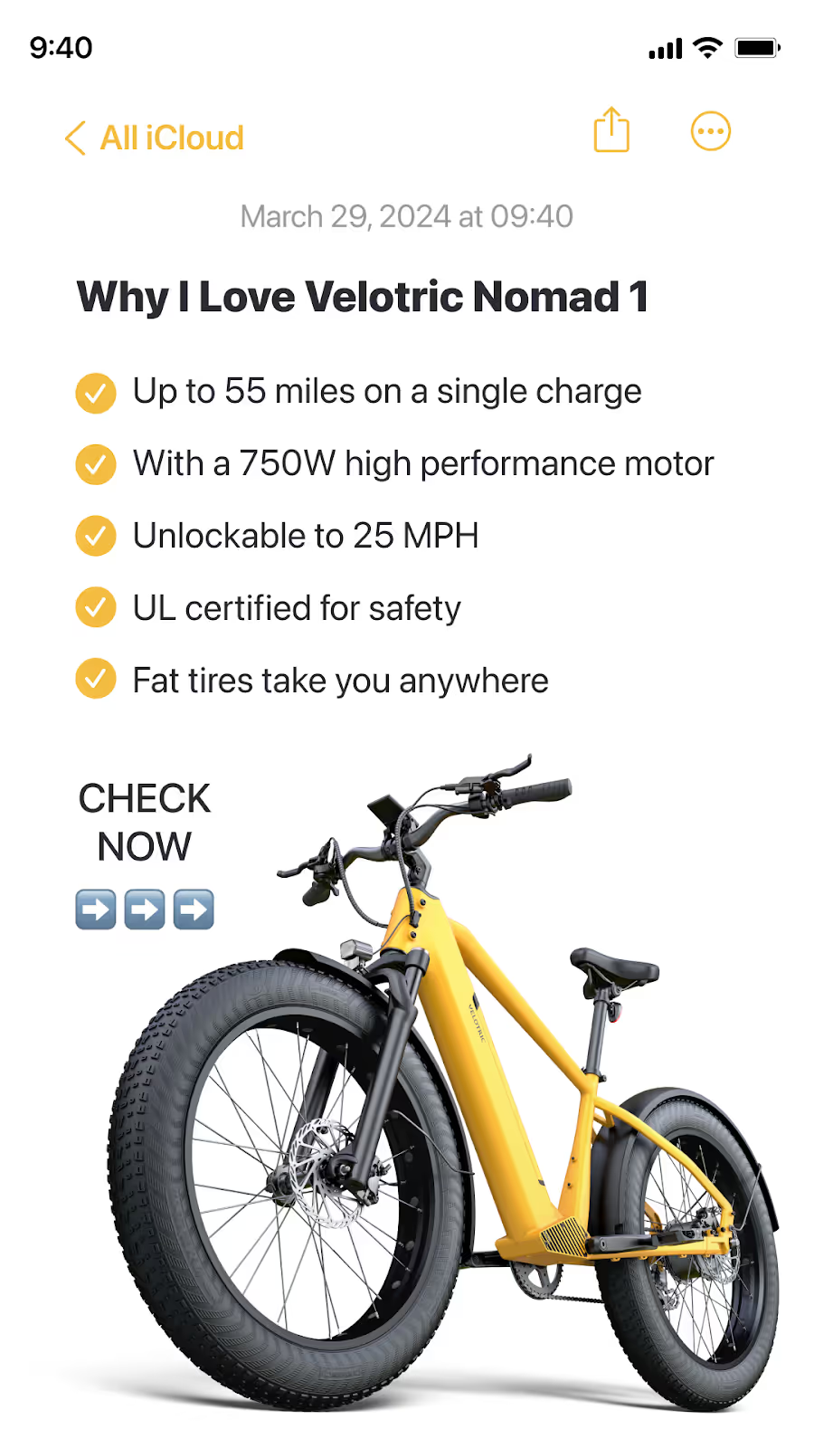
- Ad Type: Feature Callout Ad
- Visual: The iPhone Notes layout adds a personal touch, while the yellow theme and vibrant product image capture a sense of adventure.
- CTA: “Check now”
- What’s good about this ad: Bullet points with key features emphasize the bike’s performance, and arrow emojis encourage immediate action. The first-person headline connects with users’ aspirations, making the ad feel relatable and inviting.
12. AG1
Format: Feed ad
Objective: Build trust & drive trial
Strategy: Social proof + humorous testimonial
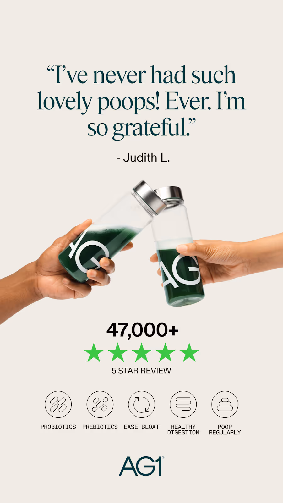
- Ad Type: Social Proof Ad
- Visual: The eye-catching quote draws attention right away, while two hands clinking AG1 bottles highlight the product in action. The five-star rating and “47,000+ 5-Star Reviews” add credibility. Icons showcasing probiotics, prebiotics, and digestion benefits make the health perks clear. The green, fresh color scheme gives the ad a clean, healthy feel.
- What’s good about this ad: The humorous, relatable testimonial makes this ad memorable and engaging. The icons break down the product’s benefits simply, and the impressive “47,000+” five-star reviews build trust, encouraging viewers to give AG1 a try.
13. Huel
Format: Stories ad
Objective: Drive conversions
Strategy: Bold claim + key stats
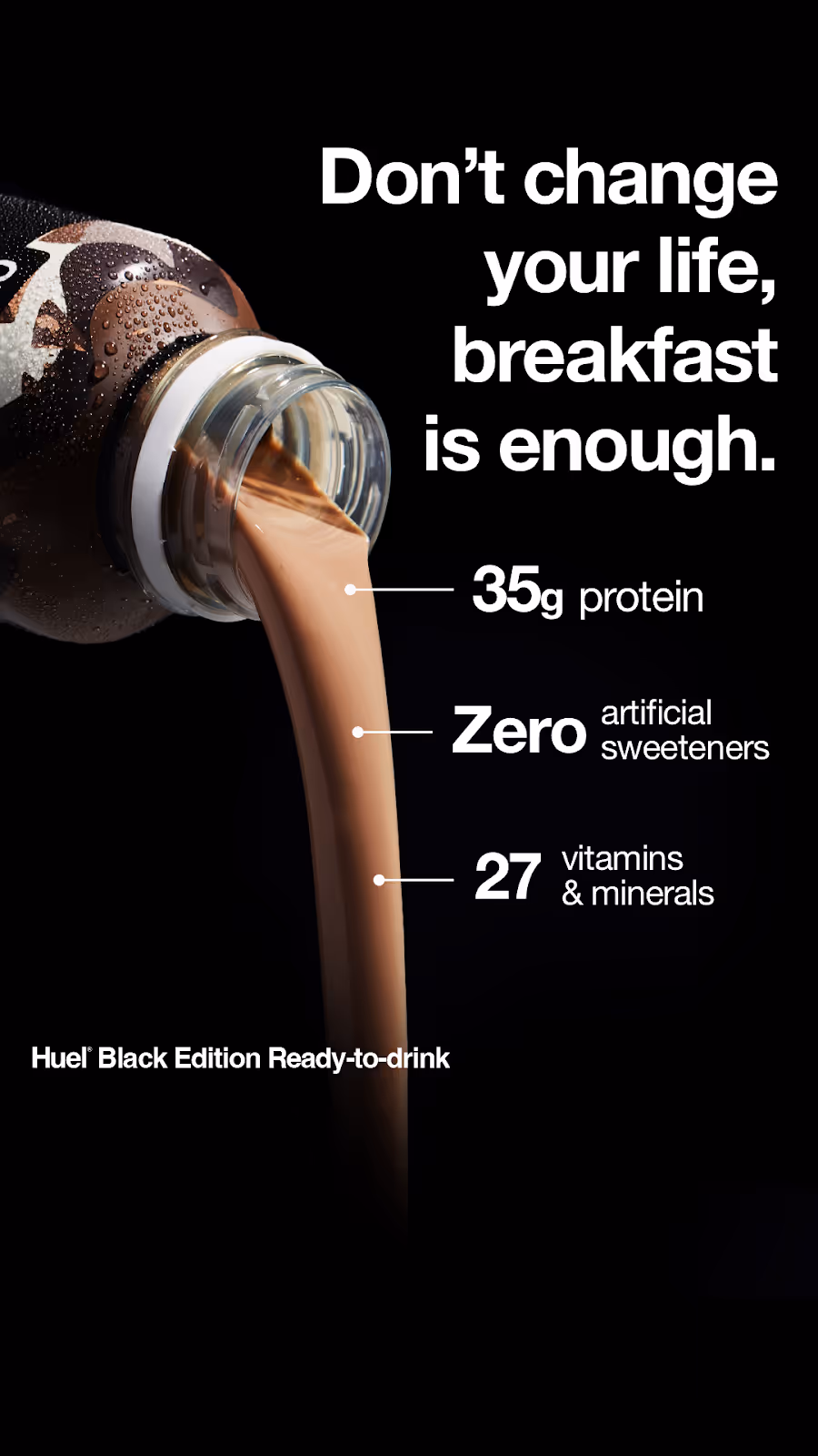
- Ad Type: Explainer Ad
- Visual: A close-up of the product in action (liquid being poured) against a dark background immediately grabs attention. Key product benefits are listed in simple text alongside a strong statement. The product name is displayed in a smaller font at the bottom for clarification.
- What’s good about this ad: This simple, bold design effectively highlights Huel’s nutritional benefits. The direct statement suggests that Huel offers an easy, effective nutrition solution for people without requiring drastic lifestyle changes.
14. Cymbiotika
Format: Stories ad
Objective: Educate & drive subscriptions
Strategy: Ingredient breakdown + subscription offer
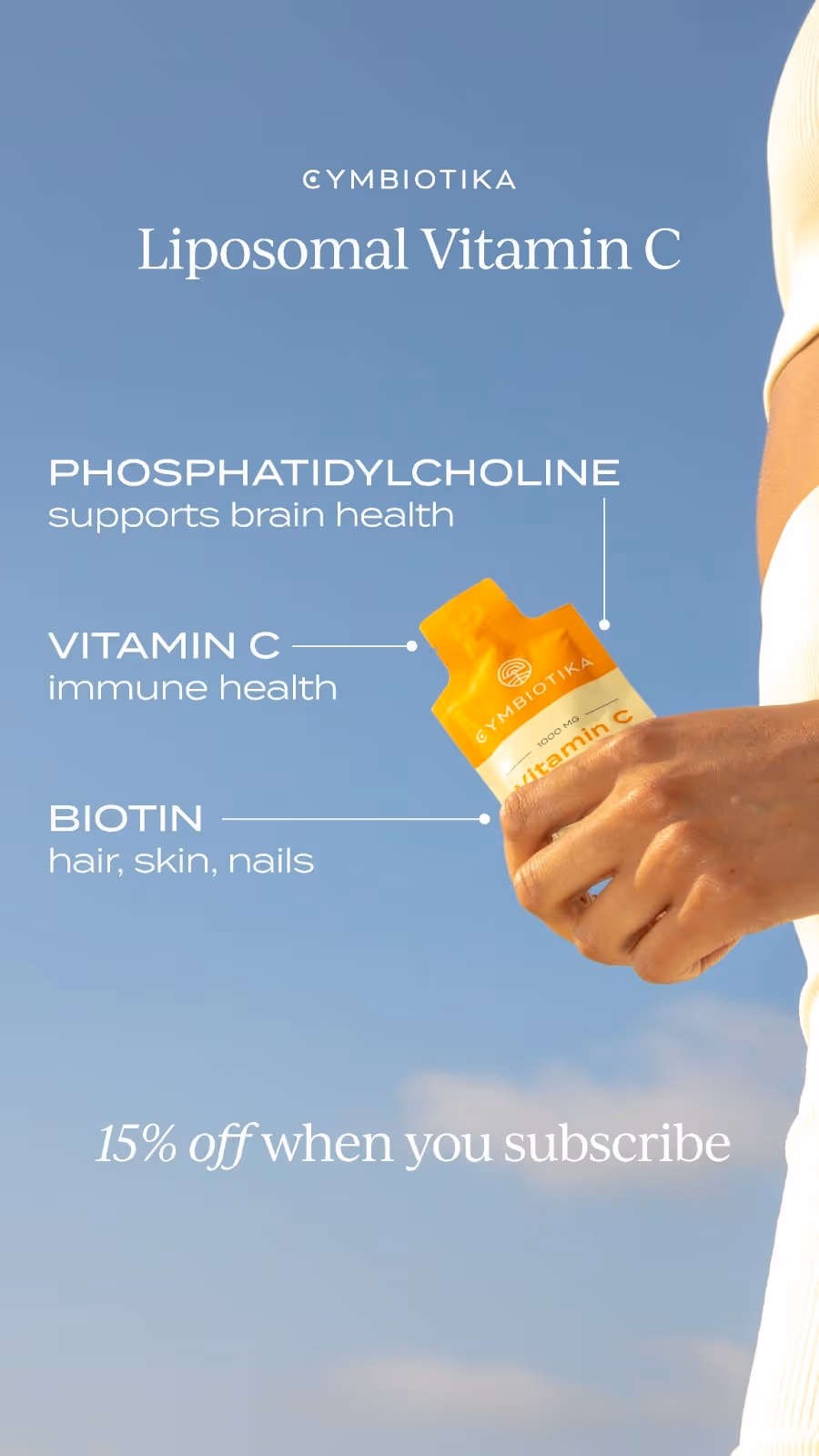
- Ad Type: Explainer Ad
- Visual: The product image shows the name of the product for clarification, while the hand holding it adds a bit of a human touch. The sunny, bright imagery brings a sense of wellness and relaxation, resonating with the product positioning.
- What’s good about this ad: The ad spotlights the product’s benefits with a clean, elegant design, appealing to health-conscious consumers. The key ingredients and their benefits are listed for credibility and transparency. The serene background and straightforward labels make it easy to understand the message.
15. cove
Format: Feed ad
Objective: Drive consideration & sales
Strategy: Emotional hook + product demo + discount offer
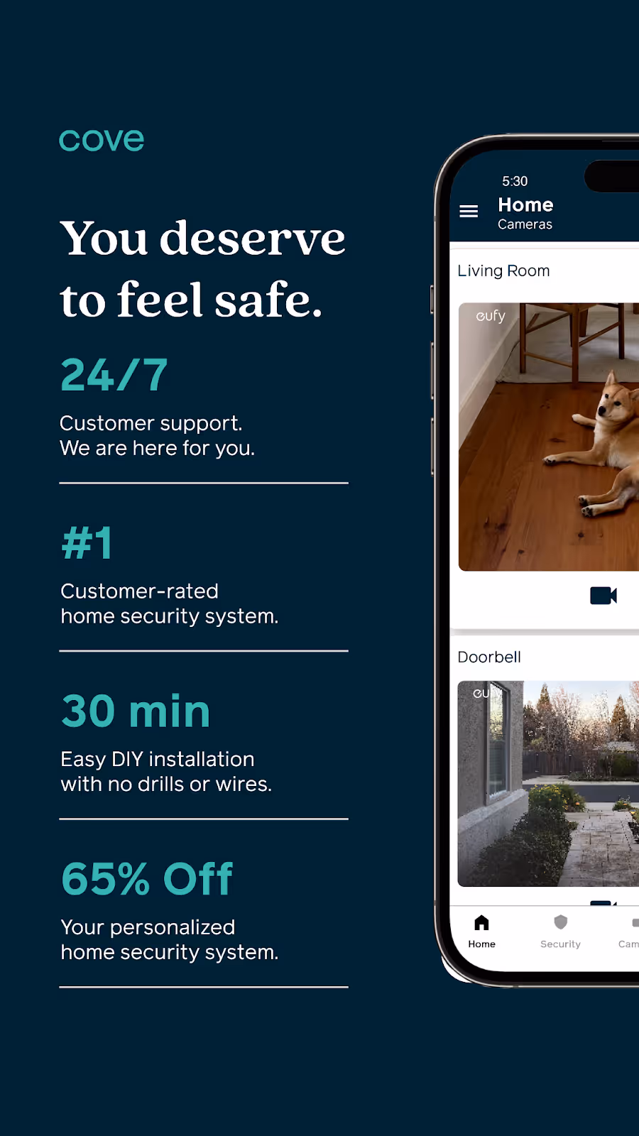
- Ad Type: Feature Callout Ad
- Visual: The interface on the right shows how the product works—live camera feeds of a home. Key features listed on the left are highlighted with statistics that grab attention.
- What’s good about this ad: The ad highlights Cove’s core features by using a phone mockup to show how the app and system work. The message, “You deserve to feel safe,” emphasizes the brand’s commitment to security and is reinforced by the listed features.
👋🏼 Many companies pair Instagram ad efforts with Facebook. Read this blog to learn about the best Facebook ad examples.
{{ad-library}}
What makes Instagram ads different?
Instagram ads operate differently from other platforms. Understanding these differences helps you create more effective campaigns:
Visual-first platform
Instagram users expect high-quality, aesthetically pleasing content. Unlike Facebook, where text-heavy posts can work, Instagram ads need to lead with striking visuals that stop the scroll.
Native content wins
The best Instagram ad examples look like content from friends or creators. UGC-style ads (user-generated content) often outperform polished studio productions because they feel authentic and blend into the feed.
Full-screen immersion
Stories and Reels take over the entire screen, creating an immersive experience. This means no competing content and you have the user's full attention for those few seconds.
Shopping integration
Instagram's native shopping features let users buy without leaving the app. Product tagging, shoppable posts, and the Shop tab create a seamless path from discovery to purchase.
Younger, engaged audience
Instagram skews younger than Facebook, with users who actively engage with brands. 71% of users are under 35, making it ideal for DTC, fashion, beauty, and lifestyle brands.
Instagram ad formats explained
Choosing the right format is crucial. Here's when to use each Instagram ad format:
Instagram ad specs & safe zones
Getting specs wrong means your ads look unprofessional or get cropped awkwardly. Here's the complete reference:
Image specifications
Video specifications
Text limits
- Primary text: 2,200 characters (but only ~125 visible before "more")
- Headline: 40 characters recommended
- Hashtags: 30 max (but 3-5 targeted hashtags perform better)
Safe zones for Stories/Reels
- Top 14%: Avoid covered by username, time, icons
- Bottom 20%: Avoid covered by CTA button, swipe-up, message field
- Center 66%: Safe zone for key messaging and visuals
Do's and don'ts for Instagram ad design
Do's
- Optimize for mobile-first viewing: Use vertical 9:16 format when possible and make text readable on small screens.
- Keep branding subtle but consistent: Integrate brand elements naturally, maintain a recognizable style, and use consistent color schemes and fonts.
- Tell visual stories: Show products in real-life contexts if applicable, or create a space where your audience can see themself in. Create emotional connections with your visuals.
- Targeted messaging: Think about your target audience's persona. By using language, themes, and imagery that resonate with a particular demographic, good Instagram ads speak directly to the hearts and minds of their audience.
- Lead with a scroll-stopping hook: You have 1-3 seconds to grab attention. Use bold visuals, unexpected imagery, or pattern-breaking content that makes users stop scrolling.
- Embrace UGC aesthetics: User-generated content style often outperforms polished studio content. Mobile-shot, authentic-feeling creative builds trust and feels native to the platform.
- Use movement strategically: Boomerangs, GIFs, subtle motion graphics, and video catch attention better than static images, especially in a feed full of still photos.
- Include social proof: Reviews, star ratings, testimonial quotes, and specific numbers ("29,931 5-star reviews") build credibility instantly.
Don'ts
- Over-design: Don't clutter compositions and don't overcomplicate visuals.
- Overwhelm with text: Avoid putting too much text into your visuals. Instagram is where attractive visuals with minimal text dominate attention. Let the image or video do most of the talking.
- Neglect ad placements: Consider, or even better, test where your ad will perform best (feed, stories, explore, etc.) and tailor the size, content, and format to fit the placement.
- Forget to update ads frequently: Don't let your ad creatives become stale. Keep the content fresh and engaging to avoid ad fatigue among your target audience.
- Ignore creative fatigue: Even your best-performing ads will decline over time. Monitor frequency (aim for under 4-7 views per user) and refresh creative every 2-4 weeks.
- Skip the safe zones: Placing key messaging or CTAs where Instagram's UI elements appear means users won't see your most important content.
- Use low-quality or stretched images: Instagram is a visual platform; pixelated, blurry, or improperly cropped images destroy credibility instantly.
- Sound-on only content: 70%+ of Stories and Reels are watched without sound. Always add captions or design for sound-off viewing.
👋🏼 If you’re starting fresh, it might be best for you to seek some assistance to set up these ads or help with ad creatives. Check out this listicle of the best Instagram ads agencies and choose the right one for you.
Matching Instagram ad formats to business objectives
Different objectives require different formats. Here's how to match your goals to the right Instagram ad type:
Brand awareness
- Best formats: Reels, Stories, Explore ads
- Strategy: Prioritize reach and impressions over clicks. Use entertaining, shareable content that introduces your brand personality.
- Metrics to track: Reach, impressions, video views, brand lift
Conversions (sales/signups)
- Best formats: Feed ads, Carousel ads, Shopping ads
- Strategy: Strong CTAs, clear value propositions, retargeting warm audiences. Use social proof and urgency.
- Metrics to track: ROAS, conversion rate, cost per purchase, CTR
Lead generation
- Best formats: Stories ads with lead forms, Feed ads
- Strategy: Offer value in exchange for contact info (guides, discounts, exclusive content). Keep forms short.
- Metrics to track: Cost per lead, lead quality, form completion rate
App installs
- Best formats: Reels, Stories, Feed ads
- Strategy: Show the app in action, highlight key features, use social proof (app store ratings, download numbers).
- Metrics to track: Cost per install, install rate, post-install actions
Driving foot traffic
- Best formats: Stories with location stickers, Local awareness ads
- Strategy: Geo-target users near your location, highlight in-store exclusives, use "Get Directions" CTA.
- Metrics to track: Store visits, direction requests, local reach
Email list growth
- Best formats: Feed ads, Carousel ads
- Strategy: Offer lead magnets (discounts, guides, early access) in exchange for email signup.
- Metrics to track: Cost per email, signup rate, list quality
Key metrics for Instagram ads
Understanding your numbers separates successful Instagram advertising from wasted budget:
Return on ad spend (ROAS)
This means evenue generated divided by ad spend. A 3x ROAS means $3 revenue for every $1 spent. Target varies by margin; high-margin products can profit at 2x, low-margin products may need 5x+. Top Instagram advertisers achieve 340%+ ROAS with optimized campaigns.
Click-through rate (CTR)
This means clicks divided by impressions. Average Instagram ad CTR is 0.50% - 1.00%. Above 1% is strong. Below 0.30% signals creative or targeting issues. Stories and Reels typically see higher CTR than Feed ads.
Cost per mille (CPM)
This is cost per 1,000 impressions. Instagram CPM typically ranges from $5 to $15, higher than Facebook due to engagement quality. Rising CPM often signals audience saturation or increased competition.
Cost per click (CPC)
It means how much you pay per click. Average Instagram CPC is $0.50-$2.00. Track trends over time. Rising CPC with flat CTR means creative is fatiguing.
Conversion rate
This is the percentage of clickers who complete your desired action. Depends heavily on landing page quality and audience intent. Retargeting audiences convert 3-5x higher than cold audiences.
Frequency
It means the average number of times each user sees your ad. Keep frequency under 4-7 to avoid creative fatigue. Set frequency caps in your campaign settings.
Cost per acquisition (CPA) / Customer acquisition cost (CAC)
This indicates the total cost to acquire one customer. Calculate your maximum acceptable CPA based on customer lifetime value (LTV). If LTV is $100, you might accept a $25 CAC for 4x return.
Video metrics (for Stories/Reels):
- 3-second video views: How many watched past the hook
- ThruPlay: Watched to completion or 15+ seconds
- Average watch time: Indicates content engagement
The power of UGC on Instagram
User-generated content (UGC) has become the dominant creative strategy on Instagram. Here's why and how to leverage it:
Why UGC outperforms studio content
- Authenticity: UGC feels like content from friends, not brands. Users trust peer recommendations over advertising.
- Native feel: Mobile-shot content blends into feeds and Stories, reducing "ad blindness."
- Higher recall: Meta research shows mobile-shot content has higher brand recall than studio-produced ads.
- Lower production costs: Real customer content is cheaper to source than professional shoots.
- Social proof built-in: UGC inherently demonstrates that real people use and love your product.
Types of UGC for Instagram ads
- Customer testimonials: Real customers sharing their experience on camera
- Unboxing videos: First reactions to receiving your product
- Before/after content: Transformation stories (beauty, fitness, home)
- Tutorial/how-to: Customers showing how they use your product
- Selfie-style reviews: Casual, direct-to-camera product reviews
- Behind-the-scenes: Artisan process videos, "day in the life" content
How to source UGC
- Encourage organic sharing: Create hashtags, run contests, feature customer content
- Partner with micro-influencers: Pay for authentic-style content at scale
- Use UGC platforms: Tools like Dash Hudson, Cropink, or creator marketplaces
- Repurpose reviews: Turn written reviews into visual testimonials
UGC best practices
- Keep the raw, unpolished aesthetic. Don't over-edit
- Get proper permissions and rights before using
- Test UGC against studio content, let data decide
- Rotate UGC frequently to avoid fatigue
The Jones Road Beauty ad above demonstrates this perfectly. The testimonial quote feels like a real customer sharing their experience, not a brand boasting about itself.
How to combat creative fatigue
Creative fatigue happens when your audience sees the same ad too many times, causing performance to decline. It's one of the biggest challenges in Instagram advertising.
Signs of creative fatigue
- Declining CTR over time
- Rising CPC and CPM
- Increasing frequency with flat or declining conversions
- Negative comments ("I've seen this ad 100 times")
How to prevent and address creative fatigue
1. Monitor frequency religiously: Keep frequency under 4-7 views per user. Set frequency caps in Ads Manager to automatically limit exposure.
2. Rotate creative regularly: Refresh creative every 2-4 weeks, even if performance is still good. Have multiple ad variations running simultaneously.
3. Create modular content: Build ads with swappable elements—different hooks, different backgrounds, different CTAs. This lets you create variations quickly.
4. Segment your audience: Different audiences should see different creatives. Someone who's never heard of you needs different messaging than a cart abandoner.
5. Use dynamic creative: Instagram's dynamic creative feature automatically tests combinations of headlines, images, and CTAs to find winners.
6. Vary your formats: If your Feed ads are fatiguing, try Stories or Reels. Different formats feel fresh even with similar messaging.
7. Expand your audience: Sometimes fatigue means you've saturated your current audience. Test new interest targets or lookalikes.
Creative refresh checklist:
- New hook/opening (most important)
- New background or setting
- New music/sound (for video)
- New CTA wording
- New social proof/testimonials
- New offer or angle
AI tools for creating Instagram ads
AI-powered tools are transforming how brands create Instagram ads—reducing production time from days to minutes:
How to use AI effectively:
- For ideation: Generate multiple concepts quickly, then refine the best ones
- For variations: Create 10-20 ad variations for testing without manual design work
- For copy: Generate headline and CTA options, but review for brand voice
- For iteration: Quickly refresh fatigued creative with new AI-generated versions
Important: AI-generated content still needs human review. Check for brand consistency, factual accuracy, and authentic voice before publishing.
A/B testing your Instagram ads
A/B testing is how you discover what actually works with your audience, not what you think works:
What to test (in priority order)
1. Creative/visual
The biggest impact variable. Test:
- UGC vs. studio content
- Video vs. static image
- Different hooks (first 3 seconds of video)
- Different color schemes
- Faces vs. no faces
- Product-focused vs. lifestyle
2. Headline/copy
- Benefit-focused vs. feature-focused
- Question vs. statement
- Short vs. long copy
- Emoji vs. no emoji
- Different value propositions
3. CTA
- Different CTA buttons (Learn More vs. Shop Now vs. Sign Up)
- Different CTA wording in the copy
- Urgency ("Limited time") vs. no urgency
4. Audience
- Different interest targets
- Different lookalike sources
- Different age/gender segments
- Retargeting vs. prospecting
5. Format/placement
- Feed vs. Stories vs. Reels
- Carousel vs. single image
- Different aspect ratios
A/B testing best practices
- Test one variable at a time — otherwise you won't know what caused the difference
- Give tests enough budget and time — aim for statistical significance (usually 1,000+ impressions per variation)
- Define success metrics upfront — CTR? Conversions? ROAS?
- Document and learn — build a testing library of what works for your brand
- Test continuously — your audience and the platform evolve constantly
Quick testing framework
- Hypothesis: "UGC video will outperform studio photography for conversion"
- Test: Run both with identical targeting and budget
- Measure: Compare conversion rate and CPA after 7 days
- Learn: Document the result and apply it to future campaigns
- Iterate: Test next hypothesis
Instagram ads for small businesses
You don't need a massive budget to succeed with Instagram ads. Here's how to maximize limited resources:
Start with retargeting
Your warmest audience is the website visitors, past customers, and email subscribers, and they convert at the lowest cost. Start here before spending on cold audiences.
Use UGC to reduce production costs
Customer photos, testimonials, and reviews are free (or cheap) and often outperform expensive studio shoots.
Focus on one format first
Master Feed ads before expanding to Stories and Reels. Spreading too thin with a limited budget reduces learning.
Leverage Instagram's AI
Use Advantage+ campaigns and dynamic creatives to let Instagram's algorithm optimize for you; it works especially well with a limited testing budget.
Start with $10-20/day
This is enough to gather data and find what works. Scale what performs, cut what doesn't.
Minimum viable creative:
- Phone camera + good lighting + your product
- Canva for simple graphics
- Customer quotes overlaid on product photos
- Before/after comparisons
Small business budget allocation:
- 70% on retargeting warm audiences
- 20% on lookalike audiences
- 10% on testing cold interest audiences
Final thoughts
The best Instagram ad examples share common DNA: they stop the scroll with compelling visuals, feel native to the platform, and communicate value quickly. Whether you're inspired by Linktree's bold problem-solution approach, Descript's clever meme format, or Jones Road Beauty's social proof stacking, the principles remain consistent.
Remember that Instagram is a visual-first, entertainment-driven platform. Your ads are competing with content from friends, creators, and celebrities—not just other brands. The bar for attention is high, and the solution is creative, which doesn't feel like advertising.
Embrace UGC-style content that feels authentic. Use AI tools to create variations quickly and test relentlessly. Monitor creative fatigue and refresh before performance declines. Match your ad format to your business objective, and track the metrics that actually matter for your goals.
The brands winning on Instagram in 2026 are those treating creative as their primary optimization lever, not just an afterthought to targeting and bidding strategies.
{{redirect}}
Frequently asked questions
What is the 5-3-1 rule on Instagram?
The 5-3-1 rule is a content strategy guideline: for every 9 posts, 5 should be content from others (shares, reposts, UGC), 3 should be original content you've created, and 1 should be promotional/sales content. This ratio keeps your feed valuable and engaging rather than overly salesy. For Instagram ads, the principle still applies—even paid content should feel valuable and native, not purely promotional.
What is the 3-2-1 rule on Instagram?
The 3-2-1 rule is another content mix guideline: 3 pieces of educational/valuable content, 2 pieces of personal/behind-the-scenes content, and 1 promotional piece. For Instagram advertising, this translates to leading with value (tips, entertainment, inspiration) rather than hard selling. Ads that educate or entertain typically outperform purely promotional content.
What do good Instagram ads look like?
The best Instagram ad examples share these traits: scroll-stopping visuals that grab attention in 1-3 seconds, native-feeling content that blends with organic posts (often UGC-style), clear value propositions communicated quickly, strong CTAs that tell users exactly what to do next, and mobile-first design optimized for vertical viewing. Good Instagram ads don't look like ads—they look like content users would choose to engage with.
How to make a good ad for Instagram?
Start with a scroll-stopping hook—you have 1-3 seconds to grab attention. Use vertical format (9:16 for Stories/Reels, 4:5 for Feed) to maximize screen real estate. Keep text minimal and let visuals do the heavy lifting. Include social proof when possible (reviews, testimonials, user counts). Design for sound-off viewing with captions. End with a clear CTA. Test multiple variations using A/B testing and refresh creative every 2-4 weeks to combat creative fatigue.
How much do Instagram ads cost?
Instagram ad costs vary by objective, targeting, and competition. Typical ranges: CPM (cost per 1,000 impressions) runs $5-$15, higher than Facebook due to engagement quality. CPC (cost per click) averages $0.50-$2.00. For conversions, expect CPA of $5-$50+ depending on your product price point and funnel efficiency. Start with $10-20/day to test, then scale what works. Retargeting campaigns typically deliver the best ROI for limited budgets.
What's the best Instagram ad format?
There's no single "best" format—it depends on your objective. For brand awareness, Reels and Stories offer immersive experiences. For conversions, Feed ads and Shopping ads with clear CTAs work well. For storytelling, Carousel ads let you sequence multiple images or videos. For reaching new audiences, Explore ads target users in discovery mode. Test multiple formats and let your metrics guide you—what works varies by industry and audience.
How do I combat ad fatigue on Instagram?
Creative fatigue happens when audiences see your ads too often. Combat it by: monitoring frequency (keep under 4-7 views per user), rotating creative every 2-4 weeks, using frequency caps in Ads Manager, creating multiple ad variations to test simultaneously, segmenting audiences so each group sees different creative, and varying your formats (if Feed ads fatigue, try Stories). The key is treating creative as a continuous optimization process, not a one-time production.
Should I use UGC or studio content for Instagram ads?
Test both, but UGC (user-generated content) often outperforms studio content on Instagram. Mobile-shot, authentic-feeling content builds trust and blends into feeds naturally. Meta research shows mobile-shot content has higher brand recall. However, studio content can work well for luxury brands or when showcasing product details. The best approach is testing both with your specific audience and letting the data decide.