Here’s an interesting fact you should know today: advertisers spent over $32 billion on Instagram ads last year. And most of those ads got scrolled past in under a second.
But that's not a targeting problem. Because targeting on Meta is genuinely good. The problem is almost always the creative: wrong format, weak hook, a template that was clearly designed by someone who's never actually scrolled an Instagram feed at 11 pm.
Good templates fix that. They give you a proven structure, so you're not reinventing the wheel every time you launch a campaign. But not all templates are created equal. A static feed template won't work for Reels. A Story template designed for brand awareness won't convert like one built for direct response.
This guide covers 15 Instagram ad templates for 2026 — Feed, Stories, Reels, and Carousel formats — with real examples, creative tips, and specs for each one. Whether you're running ads for an e-commerce brand, a SaaS product, an online course, or a service business, there's a format here that fits your goal.
The 15 Instagram ad templates you need to try in 2026
Template 1 - User review spotlight
Nothing builds trust like social proof. A User Review Spotlight template showcases glowing reviews or testimonials from happy customers. It’s great for Instagram because it feels authentic and relatable while still driving conversions.
Ad layout
Customer quote takes center stage in a big readable font, with product images around. The background is clean to emphasize the text.
Ad elements
- Image: High-quality photo of your product or customer profile picture.
- Header: “See why [customers] are raving about us!”
- Text: [Quote from your customer]—[customer info]
- CTA: “Shop Now.”
Tips for this format
- Choose authentic-sounding testimonials that highlight specific benefits.
- Use a clean font and make sure the review text is easy to read.
- Keep the quote short to avoid clutter.
- Add a star-rating icon to increase credibility.
User review ad example
Templet 2 - Before/after image
This template visually demonstrates the transformation your product or service delivers. It’s perfect for Instagram’s scroll-stopping nature because the contrast is instantly eye-catching.
Ad layout
Split-screen design: one half shows the “before” state, and the other half shows the “after.” Include captions or short descriptions for clarity.
Ad elements
- Image: Two side-by-side photos, one showing the problem and the other showcasing the solution.
- Header: “See the [benefit] with [product]”
- Text: “From [state] to [state]—experience the transformation yourself.”
- CTA: “Try It Now.”
Tips for this format
- Use high-quality images with consistent lighting for both “before” and “after.”
- Add a line or graphic divider to make the split clear.
- Focus on results that can be achieved in a specific timeframe (e.g., “Results in 30 Days”).
- Use captions to highlight key differences.
Before/after ad example

Templet 4 - Feature callout
Highlight 3-4 specific features of your product that are the most relevant to your target audience. It’s perfect for tech gadgets, apps, or anything with unique functionalities.
Ad layout
A close-up product image with a callout text box highlighting the feature.
Ad elements
- Image: Detailed product photo showing the feature in action.
- Header: “Meet [product’s standout feature]!”
- Text: “[Feature] helps you [specific benefit or solve problem].”
- CTA: “Learn More”
Tips for this format
- Use crisp visuals to highlight the feature.
- Focus on one feature at a time—don’t overwhelm your audience.
- Add an animation or video to show the feature in action.
- Use simple icons to complement the text.
Feature callout ad example

Templet 5 - Problem-solution ad
A tried-and-true classic, this template presents a problem your audience faces and positions your product as the solution. It’s straightforward yet effective, especially for brands targeting audiences with clear paint points.
Ad layout
Top half of the image illustrates the problem; bottom half shows the solution. A single-line question ties it all together.
Ad elements
- Image: Two contrasting visuals—one showing frustration, and the other depicting relief or satisfaction.
- Header: “Still struggling with [problem]?”
- Text: “Fix [problem] with [product/service] and see results today!”
- CTA: “Learn More” or “Get Started.”
Tips for this format
- Make the “problem” relatable—your audience should immediately see themselves in it.
- Use contrasting colors to differentiate the two halves of the image.
- Ensure the “solution” image feels aspirational but realistic.
- Test variations of the question to see what resonates most.
Problem-solution ad example

Templet 6 - Benefit-oriented ad
Focus on what your audience gains with your product or service. This template highlights clear, tangible benefits—perfect for Instagram users who like straightforward value.
Ad layout
A bright, minimalistic background with text overlaid in bold font and a single product image or lifestyle photo.
Ad elements
- Image: A clean, aspirational photo of your product or service in use. Add additional icons or statistics to support your statements.
- Header: “Get [benefit] today!”
- Text: “[Product] helps you [specific benefit].”
- CTA: “Shop Now”
Tips for this format
- Focus on one or two benefits—don’t overwhelm the audience.
- Use friendly, conversational language in the copy.
- Pair vibrant colors with plenty of whitespace to make the message pop.
- Test various images to see which one clicks best with your audience.
Benefit-oriented ad
Templet 7 - Comparison chart
This template compares your product to competitors, showcasing how yours is the better choice. It’s ideal for Instagram users who value transparency and hard facts.
Ad layout
Side-by-side columns with a clean table format. Use checkmarks, icons, or color-coded highlights to emphasize the differences.
Ad elements
- Image: Simple graphic with clear text, no clutter.
- Header: “How does [product] stack up?”
- Text: “Compare [product] to the competition and see why it’s the smart choice.”
- CTA: “See Full Comparison.”
Tips for this format
- Avoid bashing competitors—focus on your strengths.
- Keep the design simple and uncluttered.
- Highlight the most impactful benefits in the chart.
- Use consistent colors and fonts for a professional look.
Comparison ad example
Templet 8 - Discount & offer
People love discounts. And that’s why just a simple layout that highlights the offer can usually do the magic. Flashy, urgent, and conversion-driven, it’s designed to get people clicking immediately.
Ad layout
Big, bold text announcing the discount, with a product image or graphic in the background. Keep it simple.
Ad elements
- Image: A product image, colorful graphic, or lifestyle photo that complements the sale.
- Header: “Save [X]%”
- Text: “Don’t miss this limited-time offer on [product/service].”
- CTA: “Get started”
Tips for this format
- Use bold fonts and bright colors to grab attention.
- Include a sense of urgency (e.g., “Today Only” or “Ends Soon”).
- Test adding countdown timers or “limited availability” badges.
- Make the discount percentage the visual focal point.
Discount ad example

Template 8 - Google search result
This is a more creative, but also widely used format of Instagram ads. Recreate the look of a Google search result, and tie it into your product. It’s an eye-catching and clever way to connect with your audience.
Ad layout
A search bar graphic with a query related to your product, paired with a product image below.
Ad elements
- Image: A fake Google search image result that mimics the platform’s design.
- Header: “[Unique selling position of your product].”
- CTA: “Shop Now” or “Learn More.”
Tips for this format
- Keep the search query relatable and specific.
- Use subtle branding to make it feel native.
- Ensure the search result text is easy to read on smaller screens.
- Add your product image below for context.
Google search ad example

Template 9 - Tweet-themed visual
Tweet-like ads are getting popular on social media. Recreate a tweet that highlights your brand’s personality or customer experience for maximum engagement.
Ad layout
A screenshot-style image of a tweet with a branded product shot beneath it.
Ad elements
- Image: A realistic tweet mockup (username, timestamp, and all).
- Text: “[Witty tweet or relatable customer experience].”
- CTA: “Shop Now”
Tips for this format
- Use humor or relatability for higher engagement.
- Ensure the tweet matches your brand’s tone.
- Add hashtags or trending phrases to mimic real tweets.
- Make sure it’s clear your product is the focus.
Tweet-themed ad example
Template 10 - Meme-inspired ad
Memes are universally loved, so why not use them in social media ads? This is the perfect opportunity to showcase your creativity and sense of humor. It's ideal for brands with a playful, modern voice.
Ad layout
Popular meme format with text overlays and a subtle product mention.
Ad elements
- Image: Use a trending meme template, but tailor it to your product.
- Text: Be creative and stay relevant to your brand or target audience.
Tips for this format
- Stay current—use trending meme formats.
- Make sure the humor aligns with your brand voice.
- Use subtle branding to avoid overwhelming the joke.
- Don’t force it; ensure the meme feels natural.
Meme ad example
Template 11 – Reels ad (hook + value + CTA)
Reels are Instagram's highest-reach format right now. The algorithm pushes them harder than any other content type, which means your Reels ads get more eyeballs per dollar than a standard feed placement. But the creative rules are completely different.
A Reels ad needs to do three things in rapid succession: stop the scroll in the first 2 seconds, deliver value or entertainment fast enough to keep the viewer watching, and close with a clear CTA before they swipe away. The hook-value-CTA structure is the backbone of every high-performing Reels ad, whether you're selling supplements, software, or design services.
Ad layout
Full-screen vertical video (9:16). The hook occupies the first 2 to 3 seconds. This can be a bold text overlay, a surprising visual, or someone speaking directly to the camera. The middle section delivers the value: the product in action, the transformation, the story. The final 3 to 5 seconds close with a CTA and your brand identity.
Ad elements
- Video: Vertical 1080x1920px, MP4 or MOV, up to 90 seconds (aim for 15 to 30 seconds for cold audiences)
- Hook (first 2 seconds): A bold on-screen text statement ("We turned this brand around in 48 hours"), a pattern interrupt visual, or a direct-to-camera line that calls out the viewer ("If you're a marketer still doing this, watch this")
- Body: Show the product or service in real use. Raw, authentic footage outperforms polished production for most audiences. Voiceover or on-screen captions keep viewers watching with sound off
- CTA (final 3 to 5 seconds): One clear action — "link in bio," "swipe up," or "shop now" — with your logo and brand colors
- Caption: 125 characters before the "more" truncation. Front-load the hook here as well
- Audio: Trending audio increases organic reach, but for ads, original audio or voiceover is more reliable for consistent delivery
Tips for this format
- Film vertically from the start. Cropped horizontal footage looks amateur and kills credibility immediately
- Use captions and subtitles. Most Instagram users watch with sound off
- The first frame matters as much as the first second. Avoid black screens, slow zooms, or logos as your opening frame
- UGC-style footage consistently outperforms studio-produced video for Reels ads
- Test multiple hooks against the same body and CTA to find what stops the scroll for your specific audience
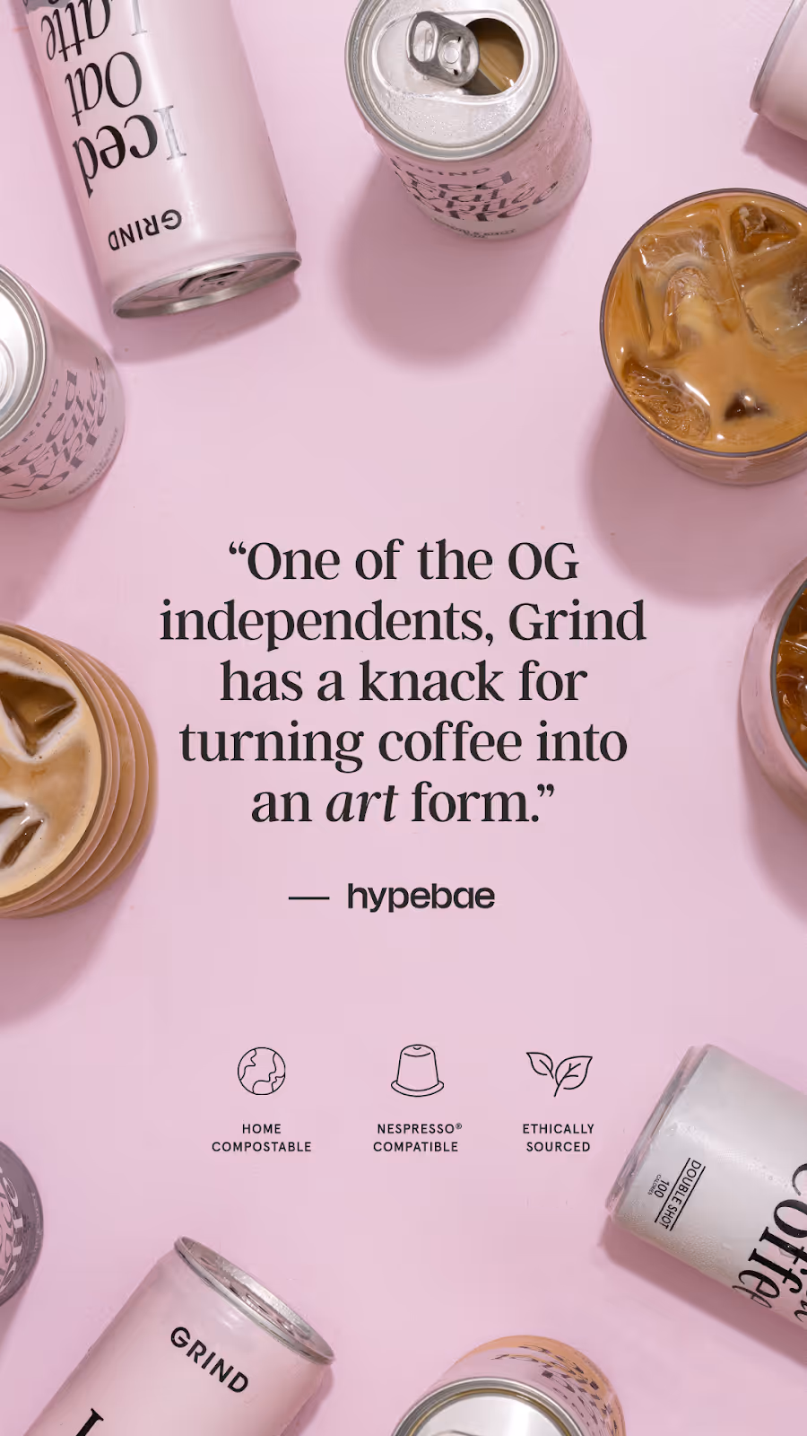
- Gymshark achieved 9x ROAS with well-structured Reels and Story creative. The format works when the hook is right
Reels ad example
.webp)
Template 12 – Instagram Story ad (static)
Story ads sit between organic Stories in a user's viewing sequence. They're full-screen, vertical, and gone in 5 seconds if the viewer taps forward. That makes them one of the most attention-demanding formats on the platform and one of the highest-converting when the creative is right.
The static Story ad is the simplest version: a single image, full-screen, with a swipe-up or CTA button at the bottom. Simple doesn't mean easy. In 5 seconds, your image needs to communicate the offer, establish the brand, and give the viewer a reason to act.
Ad layout
Full-screen vertical image. Brand identity in the upper portion, within the safe zone. Core message or visual in the center. CTA button at the bottom. Keep the composition clean as cluttered Story ads get tapped past instantly.
Ad elements
- Image: 1080x1920px, JPG or PNG. All important elements in the middle 1518px safe zone
- Headline/hook: Bold, large text. One line if possible. "Design delivered in 48 hours" beats "Professional design services for growing brands" every time
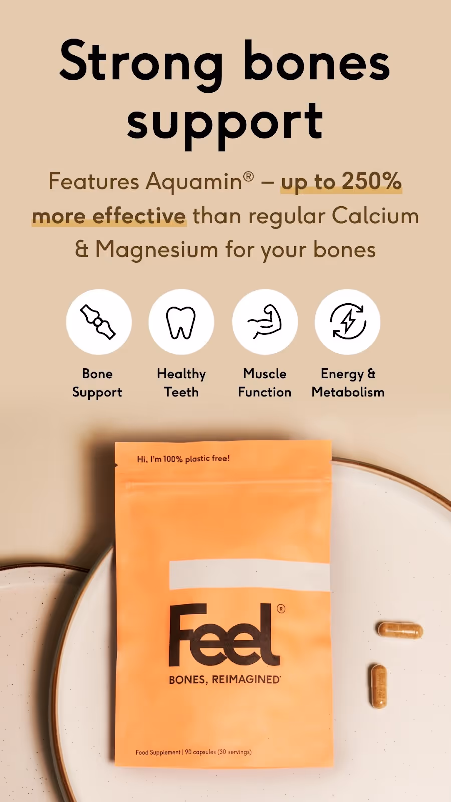
- Supporting text: One to two lines maximum. Reinforce the headline with a specific benefit or proof point, e.g. "150+ brands. 4.8/5 on Trustpilot"
- Visual: High-quality product photo, lifestyle shot, or branded graphic. The image should communicate the offer even without the text
- CTA button: "Shop now," "Learn more," "Get started," "Download"; pick the one that matches what happens when they swipe. Mismatched CTAs destroy conversion rates
- Brand logo: Top left or top right, within the safe zone. Small but visible
Tips for this format
- Design for the center of the frame. Viewers' eyes go to the middle of a Story before anywhere else
- Use high-contrast colors. Your Story will appear between organic Stories with varying aesthetics, so you need to stand out immediately
- Avoid putting important text near the top or bottom edges. Instagram's UI will cover it
- Test lifestyle imagery vs. product-only imagery. For e-commerce, lifestyle often wins. For SaaS or service brands, clean product screenshots or benefit-focused graphics tend to convert better
- Keep it to one message. Story ads that try to communicate three things communicate nothing
Story ad (static) example
.webp)
Template 13 – Instagram Story ad (interactive: poll or countdown)
This is the Story format most brands are still sleeping on. Instagram's interactive stickers, like polls, emoji sliders, quiz stickers, countdown timers, and "Ask Me Anything" prompts, etc., can be embedded directly into Story ads. And they do something static ads can't: they create a moment of active participation.
When a viewer taps a poll or moves an emoji slider, they've made a micro-commitment to your brand. That engagement signals to Instagram's algorithm that your content is worth showing to more people, and it creates a psychological connection that passive viewing doesn't.
Ad layout
Full-screen vertical image or short looping video (3 to 5 seconds) as the background. The interactive sticker sits in the center or lower center of the frame, within the safe zone. The surrounding design draws attention to the sticker without cluttering it.
Ad elements
- Background: 1080x1920px image or short video loop. Keep it visually simple so the interactive element is the focus
- Hook text: One line above the sticker that sets up the interaction — "Which one would you choose?" or "How long does this take your team?" or "True or false:"
- Interactive sticker options:
- Poll sticker: Two-option question. Great for product choices, opinion questions, or qualifying ("Are you spending more than $5k/month on design?")
- Emoji slider: "How much do you relate to this?" with a relevant emoji. Low friction, high participation
- Countdown timer: For limited offers, product launches, or event registrations. Creates genuine urgency
- Quiz sticker: Multiple choice with a correct answer reveal. Works well for educational brands or to challenge assumptions
- CTA: Swipe-up link to a landing page, product page, or Lead Gen form. Connect it logically to the interaction
- Brand logo: Within safe zone, small and unobtrusive
Tips for this format
- Make the poll question genuinely interesting to the viewer, not just a sales pitch disguised as a question. "Which pain point sounds familiar?" works better than "Would you like our product?"
- Use poll results in your follow-up retargeting. People who voted for option A get served a different ad than people who voted for option B
- Countdown timers work best for real deadlines. Fake urgency erodes trust fast
- Keep the background visual simple. The sticker is the hero of this format
- Test the emoji slider for warm audiences who already know your brand. It's lower friction than a poll and feels more playful
Story ad (interactive) example
.webp)
Template 14 – Carousel ad (swipe-through story)
Carousel ads let you run 2 to 10 cards in a single ad unit. Each card is a separate image that the viewer swipes through, which means you get multiple chances to communicate your message, tell a story, or showcase different products in one placement.
The swipe-through story structure treats the carousel like a mini narrative: card 1 hooks them, cards 2 through N deliver value or build desire, and the final card closes with a CTA. It's one of the best formats for e-commerce product showcases, step-by-step educational content, and before/after transformations that need more than one frame to land properly.
Ad layout
2 to 10 square cards (1080x1080px each), displayed in a horizontal swipe sequence in the feed. Card 1 is visible immediately and must earn the swipe. Each subsequent card reveals one piece of value. The final card is the CTA.
Ad elements
- Card 1 (hook): Bold headline, strong visual, and a clear tease of what's coming. "5 things your Instagram ads are missing" or "Here's how we redesigned this brand in a week" — with a swipe prompt
- Cards 2 to N (value): One idea per card. Keep text minimal and visual-led. For product carousels: different products or colorways. For educational carousels: one tip or step per card. For before/after: alternate between states
- Final card (CTA): One clear next step like "Shop the collection," "Book a free call," "Download the guide." Include your logo and brand colors prominently
- Each card: 1080x1080px, JPG or PNG, up to 30MB per card. Up to 10 cards per carousel
- Primary text (above carousel): 125 characters before truncation. Use this to set up the sequence
Tips for this format
- Use a visual thread across cards, such as a color, a design element, or a continuous image that bleeds from one card to the next. This rewards viewers who swipe through
- Always include a swipe prompt on card 1. Most users don't know they can swipe unless you tell them
- For e-commerce, feature your best-selling or most visually striking product on card 1, then follow with complementary items
- Cards that tell a sequential story (step 1, step 2, step 3) have higher completion rates than disconnected product grids
- Test 3-card carousels vs. 5-card carousels. More cards give you more room but also more chances to lose the viewer before the CTA
Carousel ad example
Template 15 – UGC-style ad
UGC stands for user-generated content. In the context of Instagram ads, it refers to creative that looks like it was made by a real customer or creator rather than a brand's marketing team. Think phone-filmed product unboxings, talking-head reviews filmed at home, or casual lifestyle shots that feel like something a friend posted.
It's one of the highest-performing ad formats in 2026 across almost every category, such as e-commerce, SaaS, online courses, apps, and service businesses. The reason is simple: audiences have become very good at tuning out polished, obviously branded content. UGC-style creative slips past that filter.
Ad layout
Vertical video (9:16 for Stories and Reels) or square (1:1 for Feed). Shot on a phone, in a real environment. The creator or customer speaks directly to camera or demonstrates the product in natural use. Minimal or no branded graphics overlay, hence the authenticity is the point.
Ad elements
- Video: 1080x1920px for Stories/Reels or 1080x1080px for Feed. MP4 or MOV. Filming on a phone is preferred for the UGC aesthetic. 15 to 60 seconds, depending on placement
- Hook (first 2 seconds): The creator addresses a pain point directly — "I used to spend hours briefing designers for every single campaign," or "I was skeptical about this at first but..." or a visual hook showing a surprising result
- Body: Authentic demonstration or review. Specific details ("I got the first draft back in 36 hours") outperform vague praise ("it's amazing")
- CTA: Natural and conversational — "I'd actually recommend checking them out if you're dealing with the same thing — link in bio" feels more authentic than "click the button below to buy now"
- Captions/subtitles: Essential. Most viewers watch without sound. Use auto-captions in your editing tool or burn them into the video
- Brand mention: Subtle is better than heavy. The creator mentions the brand name naturally in conversation
Tips for this format
- Real customers make the best UGC creators. Reach out to your happiest clients and offer a small incentive, such as a discount, credit, or free month, to record a 30-second video review
- If you're working with paid creators, brief them on the key message but give them latitude on delivery. Over-scripted UGC sounds scripted
- Raw footage outperforms edited footage for this format. Resist the urge to add branded lower-thirds, music beds, and motion graphics as they immediately signal "ad" to the viewer
- Test multiple creators with different demographics and delivery styles. What resonates with one audience segment may not work for another
- UGC works across every industry. For SaaS and service brands, a customer explaining how they solved a specific problem works just as well as a beauty influencer reviewing a product
- Use InVideo or CapCut for light editing — trimming dead space, adding captions, adjusting brightness — without making the footage look over-produced
UGC-style ad example
.webp)
For more ad inspiration, check out our free ad library!
{{newsletter}}
How to customize these templates for your brand
A template gives you the structure. What makes it actually work is how you make it yours. Here's how to go from template to ready-to-launch without losing what makes your brand distinct.
Step 1: Pick the format for your goal first, not your aesthetic
Don't choose a template because it looks good. Choose it because it matches where your audience is and what you want them to do. Cold audiences need hooks and storytelling, such as Reels, UGC, and Problem-Solution. Warm audiences need proof and a reason to act now, like UGC testimonials, Comparison Chart, or Countdown Story. On the other hand, retargeting audiences need low-friction CTAs, such as Feature Callout, Benefit-Oriented, and Carousel.
Step 2: Apply your brand identity consistently
Colors, fonts, logo placement. Every ad you run contributes to brand recognition over time. Audiences see your ads multiple times before they convert, and consistency is what makes that repetition work in your favor rather than just annoying people. Use Canva's brand kit feature or set up shared styles in Figma to make this fast.
Step 3: Rewrite the placeholder copy for your specific audience
Template copy is a starting point, not a finish line. Replace every generic placeholder with something specific to your product and your customer. "Get [benefit] today" becomes "Get your first design back in 48 hours." "Fix [problem] with [product]" becomes "Stop spending 6 hours briefing freelancers for every campaign." Specific copy converts. Generic copy doesn't.
Step 4: Choose one CTA and make it match the next step
Every template has one job. Pick the single most logical next action for someone seeing this specific ad at this specific funnel stage, and make the CTA button text match exactly what happens when they click. "Download the guide" converts better than "Learn more" when you're offering a guide. "Book a 20-minute call" converts better than "Contact us" when that's what the landing page offers.
Step 5: Brief your designer clearly, or use a tool that makes it fast
If you're producing these in-house, Canva and Adobe Express both have free Instagram ad template libraries you can start from. DocHipo and PosterMyWall have solid free tiers too. If you're briefing a designer, be specific about dimensions, file type, copy, and brand guidelines. Vague briefs produce vague output.
If you're running multiple campaigns and the design bottleneck is slowing you down, a subscription design service like magier gives you expert designers with a 48-hour turnaround, no long-term contracts, and no briefing a different freelancer every time.
Quick comparison: which Instagram ad template for which goal
Why Instagram ad creative matters more than ever in 2026
Instagram's average engagement rate sits at 4 to 6 percent. That's more than four times higher than Facebook. The average ROAS is around $2.50 for every $1 spent when campaigns are run well. And with over 2 billion monthly active users, the audience is there.
A few things have shifted in 2026 that directly affect how you should approach your ad templates.
Reels now dominate reach
Instagram's algorithm heavily favors Reels, both organic and paid. If you're only running static feed ads, you're leaving a significant amount of reach on the table. Reels ads require vertical 9:16 creative, a strong hook in the first 2 to 3 seconds, and a completely different visual language than a polished product photo.
UGC outperforms polished production
User-generated content style ads, be it raw, real, or filmed-on-a-phone aesthetics, consistently outperform studio-produced creative for direct response campaigns. Audiences have become very good at recognizing and ignoring ads that look too "ad-like." The brands winning on Instagram in 2026 are the ones whose ads feel native to the feed.
Thumb-stop rate is your first metric
Before click-through rate, ROAS, or conversion rate, there's the thumb-stop rate. If your ad doesn't stop the scroll in the first second, nothing else matters. Every template in this guide is built around that principle.
Interactive formats are still underused
Story ads with poll stickers, emoji sliders, and countdown timers consistently drive higher engagement than static Stories. Most brands still aren't using them. That's an opportunity.
Instagram ad specs: quick reference (2026)
Get this right before you build anything. Wrong dimensions mean your ad gets cropped. Wrong file type means it won't upload. And if your text lands in Instagram's safe zone margins on Stories, it'll be hidden behind the UI. Here the ad specs per Instagram's official guidelines:
On safe zones for Stories and Reels: The top 176px is covered by the profile info UI and the bottom 226px is covered by the CTA button and caption area. Keep everything important in the middle 1518px.
On text in feed ads: Instagram recommends keeping text under 20% of the image area. Heavy text overlays reduce delivery.
On video length: Story ads can run up to 60 seconds but perform best at 15 seconds or under. Reels ads can run up to 90 seconds but drop-off after 15 seconds is steep for cold audiences. For feed video, 15 to 30 seconds is the sweet spot.
Wrapping up
The right Instagram ad template isn't just a time-saver. It's a creative framework built on what actually works with proven structures for stopping the scroll, communicating value fast, and getting people to act.
The 15 formats in this guide cover the full range of what Instagram advertising looks like in 2026: from thumb-stopping Reels hooks to interactive Story polls, from multi-card carousel narratives to UGC-style creative that feels like it came from a real customer rather than a brand.
Pick the format that fits your goal. Customize it properly. Test more variations than you think you need to.
And if getting the creative produced fast and on-brand is the bottleneck, magier's design subscription gives you expert designers, 48-hour turnaround, and no long-term commitments. Brief once, get it done, move on to the next test.
{{redirect}}
FAQ
What is an Instagram ad template?
An Instagram ad template is a pre-built design layout for a specific ad format — Feed, Stories, Reels, or Carousel. It includes the visual structure, placeholder copy, and design elements you need to create a professional Instagram ad without starting from a blank canvas. Tools like Canva, Figma, Adobe Express, DocHipo, and PosterMyWall all offer free customizable Instagram ad templates you can edit in minutes.
What size are Instagram ad templates?
It depends on the format. Feed ads are typically 1080x1080px (square) or 1080x1350px (portrait). Story and Reels ads are 1080x1920px (vertical, 9:16 ratio). Carousel cards are 1080x1080px each. Always design to the correct dimensions from the start — resizing after the fact rarely looks right.
Where can I get free Instagram ad templates?
Canva has the largest free library of customizable Instagram ad templates, including Story and Feed formats. Figma's community section has free Instagram ad mockup templates you can edit directly. Adobe Express offers a free template builder. DocHipo and PosterMyWall have template libraries with solid free tiers. Each template in this guide also includes a free Canva or Figma link.
What makes a good Instagram ad template?
A good template has a clear visual hierarchy: the most important thing should be the first thing the eye goes to a single focused message, a specific CTA, and enough white space that the design doesn't feel cluttered. It should also be designed for the correct format. A template built for Feed won't work for Stories without significant reworking.
What is the best Instagram ad format in 2026?
For reach, Reels. Instagram's algorithm pushes Reels harder than any other format right now, which means more impressions per dollar for paid campaigns. For direct response and conversions, Story ads with strong CTAs consistently deliver low cost per result. For showcasing multiple products or telling a story, Carousel ads give you the most creative real estate. Most brands should be testing across at least two or three formats simultaneously.
How do I make my Instagram ad look less like an ad?
Use UGC-style creative. Film on a phone, use real people, show the product in natural use rather than in a studio. Avoid heavy branded graphics, corporate fonts, and stock photography. These signal "ad" immediately to an audience that's become very good at recognizing them. The closer your ad feels to organic content from a creator, the lower your CPM will be and the higher your engagement rate.
What is thumb-stop rate and why does it matter?
Thumb-stop rate measures what percentage of people who saw your ad actually paused to watch or engage with it. It's the first gate your creative has to pass before click-through rate, before ROAS, before anything else. If your ad doesn't stop the scroll in the first second, it doesn't matter how good the rest of the creative is. High thumb-stop rate starts with a strong first frame or hook.
What is the Instagram Story ad safe zone?
Instagram Stories have UI elements that cover the top and bottom of the screen. The safe zone is the area where your content won't be hidden by Instagram's interface. For a 1080x1920px Story, keep all important text and visuals within the middle section: 176px margin from the top and 226px margin from the bottom. Everything critical goes in the remaining 1518px of space in between.
Can I use the same template for Feed and Stories?
Not without significant reworking. Feed and Stories have completely different dimensions, aspect ratios, and viewing contexts. A Feed ad repurposed as a Story will have black bars on the sides and won't fill the screen, which looks unprofessional and performs poorly. Design for each placement separately, or use Canva's resize feature to adapt a Feed template to Story dimensions and then adjust the layout manually.
What is a UGC-style Instagram ad?
A UGC-style ad is creative that looks like it was made by a real customer or creator rather than a brand's marketing department. It's typically filmed on a phone, features a real person speaking naturally about the product, and avoids heavy branded graphics or studio production. UGC-style ads perform well because they feel authentic and trustworthy compared to polished brand content, which audiences have become very good at scrolling past.